Tuesday, 22 December 2015

Project; Street art


Exercise; Street art

Research point


This is my partner once we went to take our plastic dog bank for a walk. We found a wall graffiti that looks more like an act of vandalism .


An Mexican wall mural so colourful and exciting in its perspective.


Another interesting picture of Mexican wall mural taken once I went on holiday a few years ago .


This mural is on the wall near Polish train station in my home town Lodz. Picture taken a couple years ago by myself.


These three pictures has been captured in London near the Modern Tate Gallery.


             I managed to find a few pictures in my home gallery. They are not the best out off wall murals in the world as I suspect; however they are only examples of what people can create on the walls in public places. They represent a different style and capture different issues that matter to the local people. The Mexican one is clearly captured a beauty of the local land as the Polish one treats more about political issues that matter my town and country. They are a good examples of what can you do and how to use the space that is given to you. The public will pass it bye in a rush or on holidays. The question is that do we want to say through the work on the wall? Do we have any message to send? Or are we not bothered in getting to other peoples minds and make them think?


           My first idea is to create a big bold graffiti based on this sketch. I am thinking to design a look like a female clown face with a clown big makeup with some messages written on her face? Sound interesting to me but not sure where could I place it and where could it be displayed? This means that my messages should be universal.


            This idea came to me when I was looking at my photos where I had to dogs next to each other. They are absolutely different as one of them is real and the other one is plastic. I thought to create a funny illustration where the real dog is jealous about the plastic piggy bank dog. It made my smile when I picture this situation in my head.


          Another idea came to my head based on the picture I had in my gallery. This is someone who is in need and asking for money with his plastic dog that happens to be a piggy bank. I thought to give a sense of humour I should place someone with a real dog which is frustrated about the fake one.  

 The summary of my Today work


What have I done so far? :
 
·        created a spider diagram
·        did a research based on my privet pictures
·        managed to develop some ideas
·        made some comments while I was creating the sketches
 
What else would I like to achieve/do next time? :
 
·        create a complete idea for the mural
·        document my work as I go
·        do more research if needed
 
Is this work still in progress? If YES how long do I want to spent time on this exercise to be completed? :
 
·        yes this exercise is still in progress
·        approximate time needed for this exercise 4h


Day 2


             I have started to work on some ideas for the graffiti on the wall. These are my sketches but I am not really convinced that I want to go this way. I am thinking to change the field and the audience. In stead of trying to explore the wall for the general public to see I am thinking to design a wall in the kids play area in the garden  or a nursery. As I would like to work with the children audience one day. I think this is a great opportunity to practice something that may be more related to my future dream job.  


The size of this mural is impressive. The bright colours and the shapes of the animals clearly show the purpose of this work. This is something to think about once I create my own idea.


This is a lovely idea for creating a sense of magical space as the stage is for all children.


I though of using my own art work as a reference for this exercise. These are my 2year old son's walls in his room. I created this big friendly shark for him as he loves the sea and sharks. The idea was to make this wild animal as friendly as I could so he wouldn't be scared to look at him at night. The shape is quit round and exaggerated in size. His teeth are big white and round so they do not look scary. His colours are bright and with a touch of lighter tone to make him more shiny and attractive to the eye. I asked my little one to make as many hand prints on the wall to make it looks like a sea and in fact I wanted to capture the size of his little palms.


This wall represents big black cloud with small drops. I used black wall paint and in this way this space has already different use as well. My son can be creative on this surface while keeping his small pictures or whatever he wishes to stick to it as this is a magnetic paint.


I think I have an idea for this wall for the children class. How about creating a bright beautiful wall full of bubbles in different shapes? I am thinking to have a child blowing them in the air. The bubbles may go even on the ceiling?  I am very excited about this idea and my nose tells me to stick to it and develop bit more this idea.


Research on the bubbles:


Beautiful big bubbles full of different colours. It is really tricky to paint bubble and not to loose a sense of it fragile. I think I should stick to very bright and brave colours but be sure which one I want to use and not to overwork it. I will have to remember about the amount of paint layers and everything should be fine.  


The summary of my Today work:


What have I done so far? :


·         researched on children murals

·        changed and developed a new idea

·        designed a main character

·        researched and developed small sketches of bubbles


What else would I like to achieve/do next time? :


·        I have to develop more shapes of the bubbles

·        put all together the bubbles and boy's face


Is this work still in progress? If YES how long do I want to spent time on this exercise to be completed? :


·        yes still in progress

·        estimated time 2h


day 3


Being self- reflective on this exercise
 
I started this exercise from researching in my own archive of photos I took through last few years. Then I moved on to the spider diagram. It definitely was a good idea to do a few sketches as well. The list of media I used for this task is very short unfortunately:
·        black paper
·        pencils
·        colour charcoal
·        hair spray to fix the charcoal on the paper
·        Photoshop
 
I did look at the other artist however I do not think they have been a massive influence on me this time. Most of the artists are people I have no information about their names as they have been street artist which work happened to be captured on my photos. Therefore I am unable to support my self -reflective not with their names.
 
During making of my final image I managed to try a few different ideas and the last one in my opinion is the most successful. It really shows differences between my first idea and the last one. It looks like it could be on the wall on some primary school.
Am I going to work with this type of media or similar idea? Perhaps yes. I would love to explore a bit more the technique how to create a good mural in door and outdoor as well.


Project- Digital illustration Ex: Pixetaled images


Exercise: Pixelated images


After looking at some short animations on YouTube I started to be more open towards

this art technique; however I do admit this is not my cup of tea still. I am so against the art that looks like it has been made by using only a computer which this clearly represents this type of illustration.


This first image is based on the photo I took of my collection of perfumes in colourful bottles. I wanted to test how it is going to look like if I use the Photoshop and create a mosaic from my photo. I was pretty pleased with it therefore I decided to carry on this way.


Cell size: 30 square


Cell size: 19 square


Cell size: 19 square


Wednesday, 16 December 2015

Project: Self-publishing


Research point
The fanzines are often produced by individuals by their own money. These little books are mostly focused on a specific group of people. I remember when I was in high school and I was publishing the small fanzines for the fan-club of some famous singers in Poland. It was so much fun to keep updating the group of fans with the latest news about that specific pop star. I have mainly used A4 paper, some posts were written by hands and some articles were written on the computer. The last stage was to past all the information with some illustrations and pictures and then print them out using local printer. I am talking about the times when it was really hard to find good news in the media and the social media was not so popular and so fast as these days.  


Exercise: Self-publishing


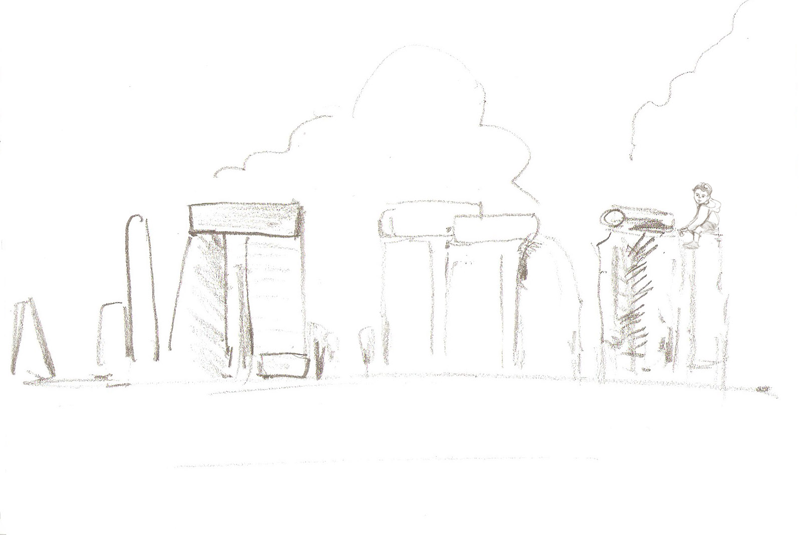
I am going to work on the little book about a boy who plays with animals peek-a-boo game around the Stonehenge area. This idea for the story came to my mind after the holydays I have spend near Stonehenge. This place is truly incredible in my opinion and it is worth of motioned in the book for the little toddlers. I have a lot of sketches of Stonehenge in my sketch book I have also made a few while I was in the Longley Park this summer. This task is about creating a story from the ideas and existing sketches from the sketch book therefore I think it is perfect opportunity to us my summer observations.


I will start from the little sketch of how I wish my page would look like.  

Then I will scan some of my previous sketches and combine then in the Photoshop with the others to create a good illustration.


I am fascinated with the author and illustrator Emily Gravett who in clever way uses her pencil drawings in her books. Her illustrations are mainly done with HB pencil and the she adds some more colours to the illustration. The charm of her illustrations is captured in the visible pencil lines. I would like to make a similar effect with my illustrations this time. Will i achieve a similar sweet and quite look of my illustrations and the boy who will be paying with the animals? I hope I will. I am going to use pictures of my little son as a reference to creating the boy's character.


These are my sketches from my sketch book from my holydays 2015


This is my first illustration. I placed a little boy on the top of the Stonehenge in the right corner.


This is my second illustration where the parrot appears on the top of the Stonehenge.


This is my third illustration where the rhino appears from the behind of the Stonehenge in the middle of the page.
The next fourth illustration represents the rhino with the little boy on his back having a good fun in front of the Stonehenge.


This fifth illustration shows a little meerkat behind the Stonehenge on the left side of the page.


And there he is on the sixth illustration a very happy meerkat in front of the Stonehenge.


Reference point :


The Introduction to illustration is very helpful short clip explaining how to use ink to create the illustration. It will be useful for me at this stage of my illustration.


day 2


I have started this exercise by looking into my sketch-book. Once I was happy with the selection of sketches I started to draw a small design of the page just to see which solution would be the best. I think that this exercise helped me to make the best use of my sketchbook as I usually don't make artwork based on already existing ideas.
 
I was also lucky to have pictures from my holidays which were another point of reference. I can definitely say my drawings helped me to create my final work. I also researched during the creative process just to make sure that I was going in the right direction with my project.
 
I have used different media and skills through this exercise as follows:
·         pencil/fine brushes
·         paper (A4 size)
·         water-proof colour ink
·         crayons
·         scanning
·         working on the illustrations with Photoshop
·         printing
·         painting
·         glue (PVA)
 
I think I managed to use my skills and combined the artistic techniques in a successful way. I have found some small technical difficulties with the media I used which was the illustration printed on ordinary printing paper. I realised that this was not a good material for sticking one page to another as it got wet and the page was not as smooth any more, it was bubbly and the surface soon crinkled.
 
I am very happy with the colour, the lines as well as the shape of my drawings and paintings, they are integral to the overall creative process.
 
I was driven by own experiences and wanted to translate them and transfer to paper. I was inspired by the children's' book illustrator Emily Gravett. She definitely had a big impact on the overall look of my little book. Once I knew the technical style I wanted to achieve it was easy for me to create the book as I knew which style I needed to stick to.
 
 
I think Emily's Gravett books like: "Meerkat Mail", "Monkey and Me", "Wolves" affected my own work a lot in positive sense of that. Especially when I look at the pencil lines I was operating with or the page execution will clearly shows the influence of this illustrator. I am also glad with the number of pencil lines I have left visible through the thin layer of waterproof ink.  I am very far from comparing myself to her; however it is nice to get the inspiration from such a good artist like her. I know her illustrations are much more polished and very professional as her style is very much so developed. Clearly she spends a lot of time on each individual illustration which I can see this is the element my illustrations are lacking.
 
To describe my final outcome I can proudly say it is something I would like to work on bit more in the future. The picture book is cute enough for the young audience in my opinion. The size is small but I could work on a bit bigger size in the future. As well the plot and lines need to be more polished. Despite all these aspect I am very much so a fan of my little fanzine.


Monday, 14 December 2015

Part four- Contemporary illustration- Project- Satirical illustration Exercise 1 and 2


Project- Satirical illustration

Research point


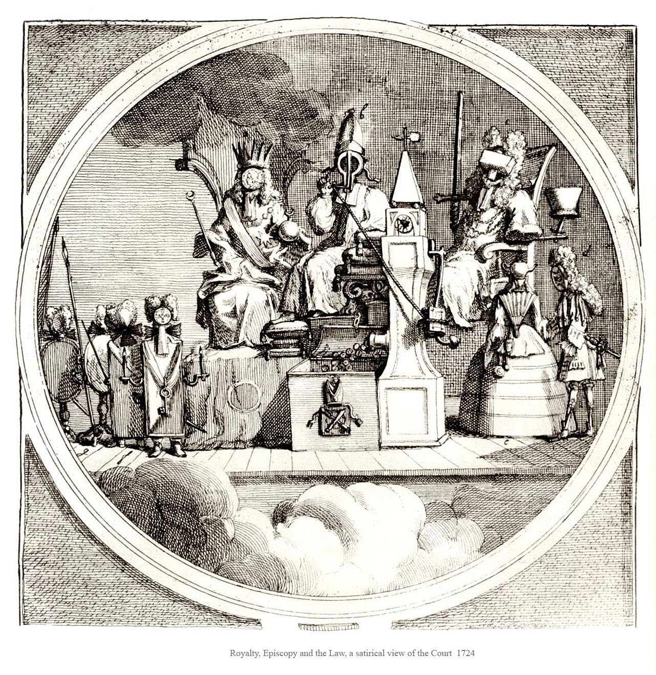
W.H " Royalty, Episcopy and the Law, a satirical view of the Court 1724


This is a classic example of the illustration that is current and will never go out of the fashion if I may say so. The  reason for that is those three main institutions are always difficult to trust. There will be constantly a reason why public will look at the with suspicious eye. If I could take this illustration and make it my in my own way I would use current representatives of these three institutions. I would look from one country to another Like : France, Italy, Poland or United Kingdom and put current names that they are in power. I would use modern style to capture the affairs between one and another person.


Research point

I have done a research on current caricature where I can easily say that the exaggeration plays key part to all of them. The success of most of them is taking the face or body features are the most recognizable for that person or celebrities and make the bigger. It could also be the style of that person or some item that he or she carries with all the time. The contemporary artists have been used this style for a long time and some of them managed to achieved great illustrations. However in my opinion this style will have not the best opinion and the main reasons are the artists who work on the streets and offer a quick caricature portrait so we can all have one at home. These people are also artists with the skill to capture our unique features and many times they make an attribute out of them.    


Exercise: Caricature and character


Lady Gaga from the song "Poker Face"


Hugh Laurie


Jeremy Clarkson


I found this exercise pretty difficult to handle as this is not my cup of tea. The caricature shows that you are able to pick on someone's negative parts of the face or body which in my opinion may be found bit rude. This part of the illustration is mainly a male sector as they have more abilities to describe other people in a sharp way. I have never been a big fan of this illustration however I can see there is a market for that like the political magazines or political websites.

I did try my best during this task. It is good to try new things and get out of your comfort zone. I am happy with a caricature of Hugh Laurie as it has still my pencil line and some soft shapes. I found this person quit easy draw and it made me fill more relaxed.

Will I be using this type of illustration in the future? Probably yes. I can not predict what sort of challenges I will come across in the future. It is good to keep this in my head as an excellent experience. Maybe I will be asked to design an illustration with that contains a caricature style as well?


Exercise: World affairs


I picked Jeremy Corbyn for this exercise as in my opinion is very colourful character on British political stage. He does not mean harm however his actions are not the most reasonable and well planned. He claims that he wants to fight for the poor people by taking from reach society; therefore he reminds me of Robin Hood I am going to draw him using only pencil then my next step will be Photoshop. I would like to achieve simple image of his face in the Robin's Hood outfit.


A quick sketch of his face and Robin's Hood outfit.


This is my finished illustration.

 Could I work on it bit more? Perhaps yes. I do get the impression that if someone is very much in the politic will probably spend more time on this project.  I do believe so I did my best; however I would like to spent more effort on polishing this illustration. Maybe I could give some more funny details to his character or by making the background more busy my illustration become more interesting? Maybe I could also use different technique? I will defiantly come back to this exercise in the future.