invisible cities
Day one working on Assignment 1
Research
I know that the houses are very important based on the description given by
Calvino; therefore I started my research from looking at the tree houses build
by the birds and this is the best picture I have found. The shape of the construction is quit
interesting and unique. The other observation I can make is that the shape is
dependent on the weight hang in the thin branch so the heavier the construction
is the house will go more down.
Day two
This are the samples for my background done with the watercolours and some
black ink.
Still do not know how will I
use them for my illustration but at least I created a mood for this work.
The one of them has been painted on the hand
towel I had from my NHS work.
Than you
NHS for providing such an inspiration piece of hand towel :).
I do really like the texture it may give to
my mountains possible.
I am in the middle of creating the foreground layer using the watercolours
and some string for the ropes. I hope to
keep this quite bright as my background is dark enough already. I am aiming to scan
all my layers and then work on them with Photoshop blending then nicely
together. Will I get a good result? Will I be satisfying enough with the final
illustration? I do hope put enough
effort to make it work.
Day three
Another day working on the illustration is looking quiet exciting as I
planned to put some more different parts like moving baskets made from brown
paper. I wish to make this more visible as I can see the pencil just disappeared
under the layer of watercolours.
My goal
for today is to finish the prototype of my foreground and background and work
with both layers on the computer. I wish to create the illustration that reflects
and shows my style so I could build up solid portfolio.
(work in progress)
This is a scan of the illustration painted with watercolours
I am not sure if I am happy with the look of it... I do like the 3D illusion
I have achieved; however there is something does not work for me. Perhaps is
the computer look of it? Or maybe the crisp colours and no pencil or brush
strokes make me feel disappointed a bit. I will give this illustration a chance and try
to blend it with the rest of the layers.
Day four
This is my first look for the chasm. I do like the dark colours and the depth between one mountain and another. The hand towel looks great as the mountains.
I changed the colours and the whole look of it. The mountains are tall and big but I lost the rough texture of paper I have used to build them.
Now I am going to think about my work and come back after a couple of days to see if I still like my final illustration. There are parts I am not pleased with and for that reason I will give this image to rest. Sometimes is good to put something on a side for a while to make a fresh observation.
Day five
Research
I am not satisfied with my current work and I fill I have to start from the beginning. I know I did not waste my time as it was very productive and creative process; however I know I can do better than this. I am capable of creating more professional illustration than the previous one. I think the problem was in the size of the paper I have used for my work. I used only A4 size paper to create the Octavia City which did not give me enough space to focused on details given in the descriptions. I did not also use the perspective well enough and for that reason I decided to start again.
I have been inspired by those You Tube movies and I would like to change the concept of my Assignment. I am not sure which part of those videos I will use in my new work but definitely they made me think about this work from the 3D effect. I wish to make my Octavia City more coming forward to the viewer and making it more 3D. Is it possible ? I am eager to try this challenge set up by myself. I am going to start from the sketches. Then I will work on mood board.
https://www.youtube.com/watch?v=oig8e0RZQfw
https://www.youtube.com/watch?v=t6hKtvnYWRU
https://www.youtube.com/watch?v=9Eu11jL6Oo4
Day six
Research in progress
I took pictures of the constructions build from
small but heavy ceramic objects to see how they look hanging above the big
chasm. They are joined together with some pipe cleaners borrowed from my little
son's creative box.
Another way to imagine how the Octavia city may
look like was to add some Christmas lights to my construction. It does look pretty
from the distance especially when the main source of light is off and only
little Christmas lights bright up the darkness of the chasm. That gives me a different perspective and look
on my work.


Day seven
My quite unique technique of creating the Octavia City is based on the spider web from pipe cleaners and some more which I attached to build a construction that looks like could potentially hold a big number of houses. This construction is held by two knitting needles stack in to two mocha muffins my a good high-street British brand :). I could create great and interesting shapes by placing the light on the model which gave me great strong shadow. In this way I could play with the shape as long as I wanted. I was inspired by Caravaggio once I was watching a movie about him and the techniques he used to create his masterpieces. This is the web side where you can find out more about his technique :
http://phys.org/news155889108.html
It is really hard to see the shadow that was on the paper as the camera gave very bright flash while the picture was taken.
Day eight
Research
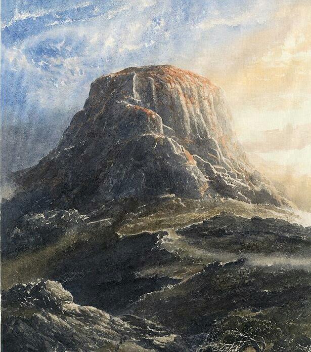
I needed some inspiration how to draw the mountains with the pencil and I
thought straight about one of the best illustrators on the planet. Alan Lee has been working on the
illustrations to the Lord of Rings for years and this mood seems to be close to
my illustration. I managed to find a few
illustrations from the Lord of Rings and Hobbit. These are the nearest to my idea that is in
my head.
Alan Lee -illustration to the Lord of Rings
Day nine
And here I am working another day on this illustration. So far I am pleased with the depth that is
showing. I draw a few houses on the separate paper then I traced them on the
big paper by using the light box.
As I suspected before this is good way to reveal the depth between the
buildings and the mountains. I am
starting to be pleased with the mood of the illustration as well. The spider web looks good to me. It is not too flat as on the previous work. I
am staring to ringing some houses to the front but making sure that there are
some in the background. I do have to
remember that this is a construction build from the strings and brunches
perhaps. I may stick some of a play dough to my spider web to see how the
houses may look like.
What a great idea with that play dough. I can see clearly now the houses in
the back and foreground. I do hope to produce
fairly good illustration based on the observation of this model.
This is drawing based on the model I did with the pipe cleaners and some play-dough.
Day ten
At this stage I can build layer after layer by making sure that the house in
the foreground is stronger than the one in the background.
If I need more strings or houses to make the
structure look fuller and more interesting I can still do it as the pencil
gives me enough freedom.
I am getting the look I am happy with.
Now I wish to draw more quirky houses, possible more lines and work on
the depth of the mountain and the chasm.
I have reduced the unnecessary pencil lines by
rubbing some of them off.
In this way
the illustration looks clear and sharper in some of the places.
I have added some more ropes to support the construction and the baskets
hang above the chasm. I do like the look of Octavia I have created.
Still a lot to do to make this drawing a
finish product; however I know I am going in good direction with this
assignment.
I am going to work on the
colours to add some depth and some sparkle in some places. Perhaps I will
choose a dark pencil for the background as I have seen in one of my previous
exercise about visual space where background was black and therefore the foreground
was more visible.
Day eleven
I have few things in my mind so I will better crack on as I really wish to
see this illustration as a finish product. I am going to use black pen to
sharpen the edges of the objects like houses and ropes.
I know this will be a time consuming part of
my work.
Then I will add more colours to
my illustration. Not sure what colours I will use yet but definitely they have
to be calm and settle as the selection of my colour pencils is not really
bright.
Anyway I do not see this work in
really bright colours.
I realised I am missing a strong support on the right side of the spider
web. I have to draw another pair of ropes to make it look really supported.
I will also draw a cloud possible also on the top right corner. I am
thinking to use black ink for the parts like mountains or the chasm....( hmm...)I
will try this idea hope it is going to add some depth and make the mountains
sharper and add some edge to the final look. ..I am very excited as I am coming
to the end of my project.
Day twelve
I was sitting in my kitchen where I had my little one drawings and paintings displayed on the fridge then suddenly got inspired by his work. I though this is what I was missing in my work, The bright colours and creative mess was perfect to make my illustration complete. My toddler does not care where and what colour place and that is what we adults missing in our painting and drawings, this freedom and careless creative process of art. Today I am going to use ink to finish my Octavia City and to give that chasm more mess and depth what is needed. Tomorrow I would like add more vibrant colours using dry pastels. Fingers crossed to make it look good.
Pictures painted by my little son Leo ( 19months old ) and his mummy
I am very pleased so far with the outlook of that chasm. I think it was a good move to use the ink and gave it more structure by placing it with the pallet knife. It is time to go sleep but I can not wait to put finishing touches tomorrow.
Day thirteen
Dry pastels are great for making the colours more settled by smudging them with the brush or finger. I am going to us this technique and see what can I do with illustration.
Finished illustration
My illustration is FINISHED !!! I am very happy how it all blended nicely, the colours look great so fresh and vibrant. I do hope I managed to meet the brief of my Assignment 1. I do know I used my own perspective at the end of the day ; however I was allowed to do so. The houses I my opinion came nicely as well as I did not repeat any of those shapes or at least I tried not to copy and make them more interesting. That was a great fun for me to built and explore their own constructions. I feel like an architect creating little town for little people.
Right part of the illustration
Middle part of the illustration
Left part of the illustration
.png)


.jpg)
.jpg)


.png)


.png)
.jpg)
.jpg)
.jpg)
.jpg)


.jpg)
.jpg)
.jpg)

.jpg)
.jpg)
.jpg)
.jpg)

.jpg)
.jpg)
.jpg)


.jpg)