Assignment two: A sense of place
Day One
RESEARCH
I decided to make a mind-map after reading the brief for the
Assignment 2. It is not easy task
however I think I am going to enjoy it.
I spent a while thinking about the place and town i live in and this is
what I managed to com with.
When I red again my tutor's report from Assignment 1 I
realised that in the last one I did not pay enough attention to the research
which very important at the beginning of work. I will make sure that this time
I explore this subject more. I know it will help a lot to create good piece of
work at the end.
I have started my research from knocking on tourist's
information door in Bishop's Stortford and asking what is the style of tourist
leaflets and souvenirs that they are most likely to take. The lady at the desk
answered me that the style that looks like a watercolour paintings of local
surroundings is highly recommended.
 picture of Bishop's Stortford tourist information office
That opinion helped me a lot with choosing the medium for my
second Assignment. I am going to paint with watercolours. Funny enough as I
always find them tricky to paint with but very rewarding as a result. So let it
be: my medium are WATERCOLOURS
My next step was to find
as many pictures of local places done with watercolour and compare their
technique, style and colours.
This picture caught my eye while I was browsing the internet.
I like the colours and the composition which is a good example of rule of
thirds.
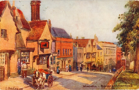
Windhill -Bishops Stortford

Black Lion Inn Bishops Stortford by Paul Symth
I wish Bishop's Stortford could look like this painting as
it represents old street with the Black Lion Pub.

Watercolour by Martin Goode
I am not sure about this one. I do not think I like it as
much as the first one, although it was good to find something different. It is
too calm and to settle as in style. I am definitely not going to produce work
in similar style to this one.

This picture does not show anything that is local to me;
however I could not resists of placing it on my blog as I totally love the
mysterious look of the scenery. The dark colours and two people walking
somewhere I wish to as them: Where are you taking me on this journey?
This next picture shows the old look of Piccadilly
Circus in London. It is amazing how most old postcards of London
or different places of U.K look similar. That proofs me I have to keep the
illustration quite simple with bight colours.

I could not resist not posting this illustration as is very British
and no matter where you go it is always a local thing if I may say :)

This beautiful painted glass caught my attention during my
research. I would like to use similar tone of colours for this assignment and
create a work or art that is different then market demands. However I know I
have to follow what public would buy and wants.

English Owl by Mark Howard
These are the local souvenirs I can buy in the Bishop's
Stortford Tourist Information Office. If I can be really honest I do not see
anything special about them. They do not make me feel I would like to comeback
to this Market Town. The blue collection
looks really dull and easy to forget.
The other one with bright and quite flashy colours looks bit tacky as
for me. My very honest opinion about them helped me to made decision how not to
paint for this project. I defiantly know this is not the style how I will lead
my assignment 2.


Dave McKean Postcard from Paris
I went yesterday to the beautiful Hatfield
Forest near Bishop's Stortford and
took a few pictures while having a pick nick with my family over there. I think
this place is great to put on the post card of tourist information as a place
to come and be attracted to visit. I definitely make it as one of my illustration.
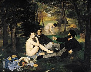
I do want to look for different artist how they paint a picnic. Therefore I immediately
browsed the most popular painting about it and was painted by E. Manet.

Edouard Manet
Day Two
I had such a productive morning. I managed to draw a few
sketches which I am going to use for this project. As I learned from previous
assignment through the process of experimenting with media I did not have any
doubts the time I am not going to mess with the computer program as much as I
did in previous one. I do want to make as much by my hands and not to relay on
the computer effect as I did before. I was very disappointed last time
therefore I focused on simple media likebrown pencil on A4 white paper this time.
Moreover I will follow my tutor advice and try not to over do it or over work
it.
Sketch no. I of Bishop's Stortford High Street during the market
on Saturday morning
Sketch no. II of Bishop's Stortford High Street during the market on Saturday morning
Sketch no. III of Bishop's Stortford High Street on Saturday morning
Day Three
I am going to start this day from making and setting the
aims so my work should be easier this time. Whenever I am I doubts I can always
comeback to this page and read again. I know there is always a possibility of
changing them (this is what is called creative process) however I would rather
stick to them at the moment.
My aims for this assignment:
- traditional
look with a modern twist
- simplicity
- clean
and tidy look
- positive
and bright colours
- make
it attractive to the customer
- remember
to not over do it. !!!!!
Day four
I am working on the illustration number one and number two.
Perhaps I will have some time to start the illustration number three as well.
I do hope I am not mistaken this time.... I am very close to
say I do really like this illustration as it ticks nearly all boxes I have
wrote above earlier. I will move on to the illustration number two. I can always comeback and make some changes. But is wrong to say stop so early? I am really in doubts as I always spend days on working with the computer program and making the illustration from the sketch to look nearly perfectly crisp. This time I do really tell to my self to stop it now!!! I really like it! But my other voice is saying keep working more and more ..... I really dislike this little voice which at the end many times spoils my work.
I am going to leave it as it is now.

I have moved on to the illustration number two. By using the
same paints as with the illustration number one but different colours I think I
will keep them similar and simple enough to be pleased with.
This is my favourite sketch so far. I really like the
composition and the buildings on the street. Unfortunately I did not have
enough time to work on it today therefore I have to come back to it tomorrow.
Perhaps it will be better for my eyes to have a rest. It is always better to
star work with different and open mind.
Day Five
I have managed to make another two sketches today. It will give me
Sketch no. IV The road leading to the Church
Street in Bishop's Stortford
Sketch no. V the Church Street in Bishop's Stortford
Day Six
Research
Just had a thought about the local artist I used to paint with for a while when I was a member of Bishop's Stortford Art Society a few years ago. This is great idea to look for the local painters and watch their perspective of the area that they live in.
http://www.bsartsociety.co.uk/

This is a work of Artist John Weston of St. James on Thorley with pen and ink.
Coming back to my work I have managed to create a watercolour painting today. I am very pleased with the look of it. In my opinion this is the best from all I have created so far. It looks quit matured in the style and colours are not to bright and yet so vivid. That shoves my progress in the assignment. The perspective is interesting enough for me to say that this is the place I live in. However not sure if this work meets the assignment's requirements as they are no people engaging at all.
Day Seven
I am going to work on the illustration abut day out in Hatfield Forrest. I have planned for myself to place more people on my illustration to show in how interesting way they interact with the local nature during the free time. Hatfield Forrest is beautiful place to come with the family for a picnic or to take a dog for a walk. I love this place so much. The threes a very old I would like to capture their majesties look.
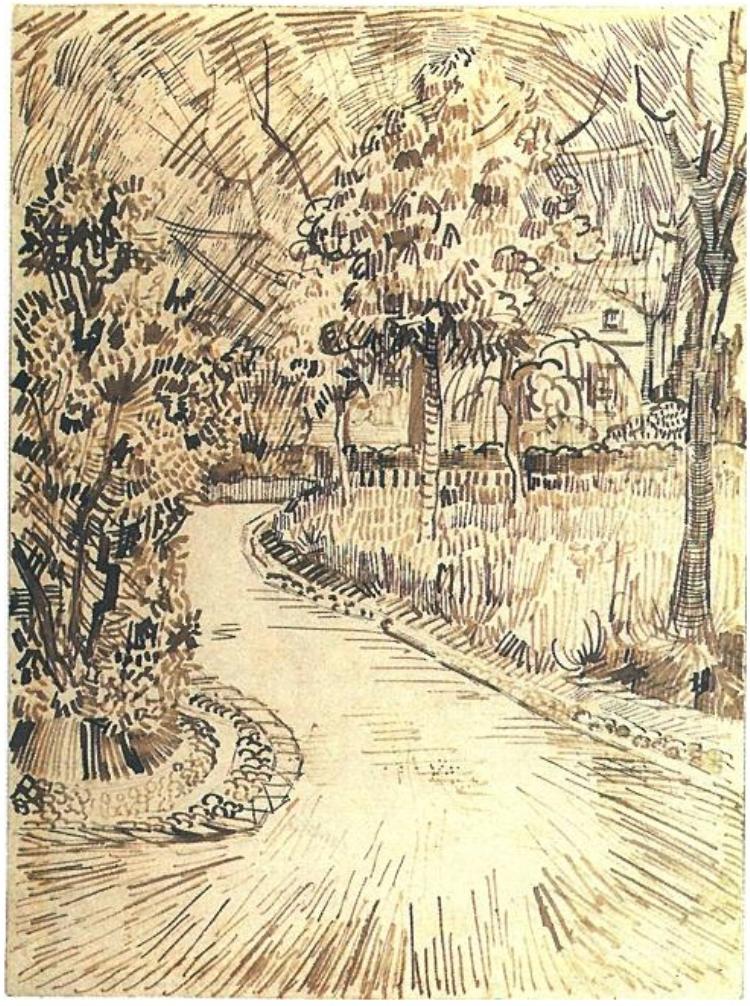
This is my very quick sketch of people walking around the forest and some of them sitting on the grass and on the clog. When I pasted it on my blog I just realised That I have seen somewhere a similas line of pencil to mine. I had to look on interent who does it remind me of ?
This is what I have remember from my art classes ages ago. A work of art created by Vincent van Gogh.
.jpg)
Vincent van Gogh A lane in the public garden with benches
Public Garden with the Corner of the Yellow House
Day Eight
working on the colours to my painting about Hatfield Forrest. This time I need to show the green spring colours. I would like to make it interesting but as I said to myself before .... NOT over do it. :).
I am very pleased with two hours I have spend on painting this illustration. Very vivid tones but not to bright and tacky I suppose. I do not want to change anything at all. I am sure that the visitors of this forest are visible for the audience. I wanted to show a spring forest therefore I had to live some gaps between some branches as the sky was clearly visible through them.
Did I succeed ? I hope I did.
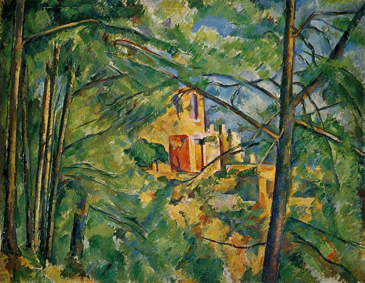
There is another piece of fine art I did remember from my art classes. I was inspired by Cézanne a lot therefore I wanted to place one o his work on my blog as a part of the research.
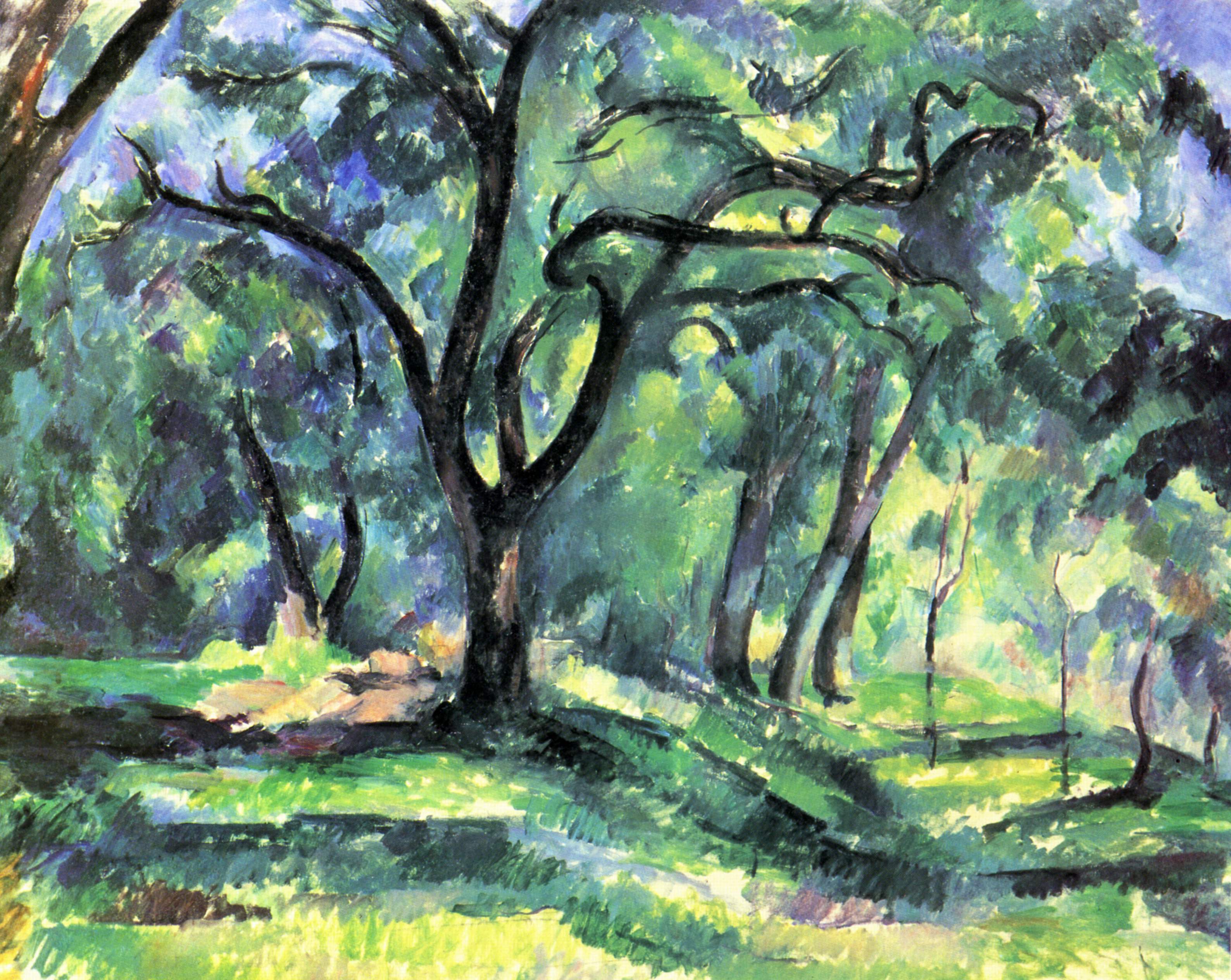
Cezanne
Day Nine
I am going to select a few finished art work today. I ma thinking to choose this one as a part of my assignment. Let me compare how do they look all together. Do they look similar in style? Are they interesting enough as a composition? Working on one each separately is different and then placing them all next to each other.
Picture 1
Picture 2
Picture 3
Picture 4
Day Ten
This is another day of work on this assignment. Looking at my illustrations so far, I
realised one thing which I am not happy with.
Although I may like the way they look and their style, some of them do
not meet the brief as they are lacking people interacting with activities. The example of that is this work no.II. This is a good thing about blog as it is very
easy to look through the artwork I've managed to produce.
work no.II
I can compare one to another and draw some conclusions and
observations. Like I said, my work is
lacking people therefore I have to come back to the places in town and try to
draw more sketches that include people.
Unfortunately I am only able to go there on Saturday mornings after my
night shift. The reason for this is my
little son is being looked after by my husband and that gives me more freedom
to do a few sketches. Nevertheless I
will do at least two more, but only with pencil and see how they look.....
As I said before, I had to do some more drawings. These are the fruits of by early creative
work in Bishop's Stortford town on Saturday when the market is there. I managed to capture the fish stand with one
customer buying a fish. I am standing in
front of a dilemma as I think from the Tourist Information perspective, what
sort of illustration would they like to see?
Possibly with more people in it so they town would look busier and
therefore more attractive to tourists.
For example if I see a picture of a market town with the
market as the main theme, but with only one person buying something from a
stall, I would definitely think that this is not the best place to visit as the
market does not attract enough people.
My question now is, should i use my imagination and draw more people in
the market? Is it ok to draw fake people
to achieve a more attractive picture for the people who may be taking my work
as a main source of knowledge about this town?
And again I am talking to myself right now, and writing down all my thoughts
about this illustration, I know the market gets very busy a bit later. Maybe I should draw at least four or five
people and not feel guilty?? I may do
some more research of people on the markets to find their gestures and facial
expressions.
That is it for today. I will draw some conclusions tomorrow.
Day Eleven
I am glad to make the final decision about the work for this
assignment. I have been asked to produce between three and five pieces of work reflecting
a real local live. At least one of them should be in colour. The biggest skill
I have gained during last projects is the ability to select my best work. I know
now that the quality is more important than a quantity. Therefore I am going to
select only four pieces of work. These
illustrations are similar in style and show people during normal day in town of
Bishop's Stortford and Hatfield
Forest.


.jpg)

.png)


.jpg)
.jpg)
.jpg)
.jpg)
.jpg)
.jpg)
.png)
.png)
.png)
.png)
.png)

.png)

.jpg)
.png)

