Research point

I managed to find this artist while I was trying to remember him from the One Show BBC. His name is Paper Dandy and his precision and attention to details is pretty impressive.


This video shows Paper Dandy during his creative process.
http://www.bbc.co.uk/news/magazine-20124705
http://www.bbc.co.uk/news/magazine-20124705
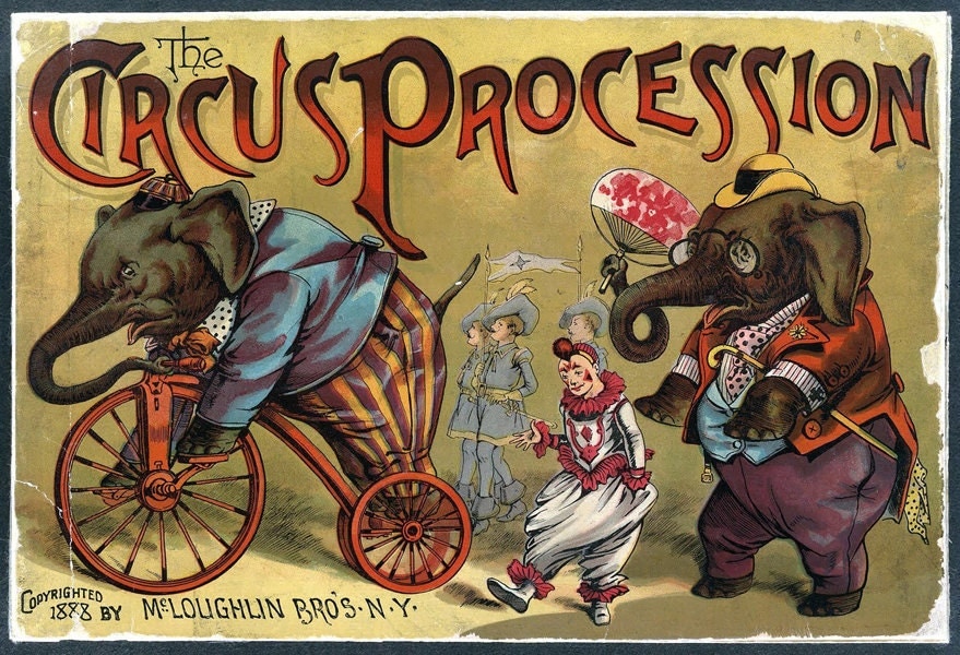
Exercise: Paper circus


To draw most of my animal shape I will use this book as a reference point. Christopher Heart is the author of this book. I bought it in charity shop one day for £1.50 and I think it is really helpful if I want to draw a shape of most popular animals. There is clearly showed hot to build a structure of the animal based on the simply shapes.

After researching the list of animals are still allowed to be use for the circus entertainments I must admit I am in two minds currently. One part of me would like to create a typical old fashion poster with all the wild animal I remember from my childhood when I did not see and realise how terrible they have been treated in captivity. For me a circus is:
a lion
an elephant
a monkey
a bear
However all the animals listed by me are not allowed to be use anymore. Kids these days are going to watch most common animals like:
a cat
a dog
a horse
a lama
a donkey
a pig
a sheep
I will try to create a poster for kids from the past and if my guilty conscious will say a word I will change my idea and create an animal friendly circus. Lets see how I will get on with this exercise.

I am not sure if I really like this monkey shape perhaps I will not use it for my exercise.

This is a good start for my lion, perhaps will cut a simply shape out of this bit later?

Or maybe I will use this one for the poster and create an illustration based only on animal heads?

I am very pleased with this big elephant which could be a great focus point for this poster.

Or if I stick to the idea of animal heads on the poster I could use this African elephant shape for instance?


this is my little sketch of on of the ideas.


The summary of my work Today:
I have managed draw and traced shapes of the animals. I picked a monkey, lion, an elephant and the bear. As I was working on the shapes of all of them I noticed that some of my animals look better and some of them are not easy to describe as a just shape. I have selected only big jumping lion, big standing bear and big elephant. I also researched old circus posters on internet to make sure what colours are mainly used to represent circus. They are usually red, blue and yellow and these colours will be also part of my poster. I chose waterproof ink for this exercise. I have four A5 ink sketches one of them hall all colours mentioned earlier and the next three represent each individual colour separately. At the moment I am not sure what will I get as a result working with all my pieces in Photoshop. I am happy with the tone and temperature of colours. I also produced hand written sign which says: CIRCUS. All my individual shapes and small paintings are now have been scanned to the computer and waiting for me to play with them in the Photoshop. I am looking for to that stage as is always exciting to experiment. I am planning to achieve poster that is appealing to the young audience not to serious and scary. I am not aiming to copy any of the vintage poster style at all as they look to terrifying to kids in my opinion as the look and image of circus has been changed for the last century.
I am not sure about this background. In my opinion it clashes with the colours of the animals. I am looking something either more settle in tones or perhaps something more visible from the distance. I will try another colour. In terms of composition this option does not look amazingly good. I will have to move some objects around in Photoshop again

This black
background is more sophisticated however the composition is definitely the
strongest part of this work. There are some elements missing like possible a
sign to know what this poster represents.

This
composition looks much better however I am not convinced about the black
background this time. How about something brighter and more cheerful perhaps?

Yes this is
what I was looking for! I am very pleased with the overlook of my poster. I
left small parts of the burgundy colour to break the line between the shapes of
the circus animals and the white background. When I look at this poster I ask
myself if some small lines and perhaps small dots for the animals will make
them look more friendly and attractive for the audience. Should I try one more
option to make this poster even better?

Being self-reflective
I started this exercise from small research on internet that
helped me to put my ideas on paper. I managed to draw a few sketches in my
sketchbook that helped me to see what sort of ideas work better. My learning
log was also useful as usually to keep on track with my ideas and to see how they
develop. I only draw from secondary sources this time using internet and the book
“Kids draw animals" by Christopher Hart as a reference.
The list of media and skills I used throughout this
exercise:
- collage
- Photoshop
- pencil
- watercolours
- combining different materials
- Thinking about colour and composition.
This task was not particular difficult therefore it is hard
for me to say which part of this exercise was the most problematic for me.
Possible the fact I wanted to keep it as poster for the children audience was a
small obstacles however I do like the last result and it works for me as an
integral work in terms of shape, form and colour.
Maybe I should look to other artists work during this
exercise; perhaps I would progress bit more and develop as n artist. I only did
a research based on the old style circus posters from the end of 19th
century and the beginning of 20th and these ones did not have the
name of the artist at all; therefore it is difficult for me to mention any name
here. I do have to admit they influenced me in terms of the subject that needed
to be captured in my poster. I took the limited choice of colours for this task
based on those old posters. I also used an old style of the shape for the circus
which in my opinion works well.
I am aware of not considering different solutions and the
reason for that is I had a clear vision of what I wanted to create and the
audience I picked for this task was not an ordinary one.
I am pleased with my final work this time. It looks clean, sophisticated in style and
fun to watch for young audience.
Exercise: Contemporary ceramics
research
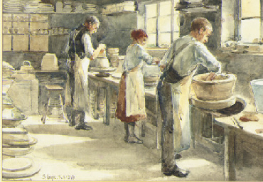
John Eyre painted people working at the pottery factory in very interesting way. The colours are nearly as pale as clay when dry. This are very nice and settle paintings in colours and temperature. Although it is shame that we can not see much more of potters from the front in which way we could observe in more details their work.
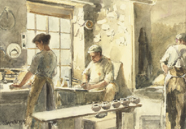
John Eyre painted people working at the pottery factory in very interesting way. The colours are nearly as pale as clay when dry. This are very nice and settle paintings in colours and temperature. Although it is shame that we can not see much more of potters from the front in which way we could observe in more details their work.
Tasks for Today:
- research
- sketches
- update my blog as I go
Estimated time needed for Today
- 2 h
Research
I do not know what exactly I am looking for to fulfil this
task. I found some pictures with the old pottery images captured in the form of
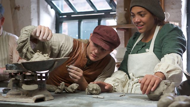
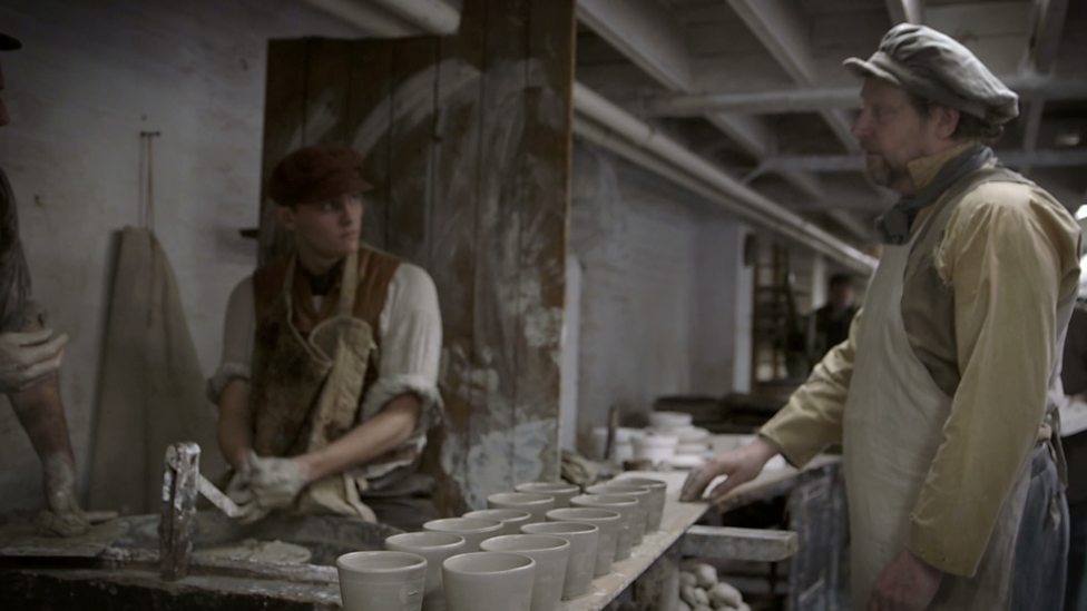
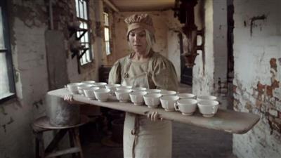
paintings. I was also trying to find the episode of BBC program called:" 24hours in
the past “where some celebrities were working in the Victorian factory of
pottery. I was really inspired and moved by this episode therefore I went on
BBC IPlayer website to watch it again.
I have also managed to find some old English pottery on internet to find out what sort of patterns people tented to use. It was interesting research as I managed to find some really sophisticated floral patterns and birds mainly in blue colour. I would like to use this knowledge and do some sketches now.


These are my sketches based on the some floral patters and the rest of them represent chickens and birds. I used the pictures of chickens I have taken on my summer holidays in


There are some visible differences in the style after a few free sketches already as my hand was more used to the shape of the chicken. I really enjoyed this part of the exercise. I only used the blue waterproof ink and ink sketching pen my first few drawings. Later on I decided to use some of the plants I collected as a reference for the floral patterns. These small plants were great to use as a natural ink brush, just like the Japanese artists do when they paint Japanese paintings.


I am going to finish my work for Today. I have managed to achieve a lot and I am very pleased with my work.
What I have done today:
- researched
- collected some plant samples
- take some pictures of those plants
- did some good sketches
- Documented everything on my blog.
Time spent on this task was 4 hours so far
Time needed to complete this exercise is another 2 hours.
Day 2


Self-reflective
I started this
exercise from a short research about the pottery and how did people use to make
it. After the research I went to making sketches with blue ink. These sketches
well a big help to me during this exercise. I draw from primary and secondary
sources. I managed to collect some plants and flowers from my local area to
make closer look on their patterns. It was really a god way of drawing from
nature and trying to capture their unique shapes and forms. I have also used
the pictures of chickens taken by me on this year summer holydays.
The media used
by me was successfully applied and use during this exercise. This is the list
of all media I have used:
·
paper
·
black waterproof ink
·
colourful waterproof ink
·
fine ink pen
·
two small objects made out from pottery
·
leafs and small plants for painting with
My idea developed through this creative process. I am very
pleased with the final effect of the pottery I have painted. The chicken n the
orange small plant pot are funny. I was surprised there was enough space for me
to tell a small story about chickens looking for something on the grass and talking
to each other. I do hope it is visible on my blog.
The blue piece with the black ink is also about the chickens but
hidden in the bushes. They look like are trying to hide from the massive storm.
To describe my final work I have to admit I am very pleased with
the result. These two pieces look very similar in the style. The size of this
pottery object is very unique. I developed as an artist because of the
technique I decide to use. I was not afraid to paint with such an unusual media
like the leaf or a small stalk. I am defiantly going to use this way of
painting in the future as it gave me a freedom and the shapes are always a mystery
to the artist. I may try to plan what to pint however the shapes are
interesting jus because unusual end of the stalks. The leafs provide very soft
and gentle way of painting.


