"You
are here"
This is a very
interesting title or phrase "you are here". The fact that I have no directions as to what
I should design makes this assignment even more exciting. When I first read it I thought maybe I could
finish it with a phrase suitable for me like "you are here and make the
most of it" or perhaps "you are here, where you should be".
I wanted to
design a few illustrations about my life and how it makes me feel. The moment of my life and is it the right
thing for me at the moment? I wanted to
describe the days with my little boy and how he makes all my moments special
and magical.
The phrase
"you are here" has a totally different meaning when I think about my
son. Although we go to ordinary places
like parks, shops etc and do ordinary things like brushing teeth or running
after the bus, it does not mean that they are ordinary for us. We make the magic happen every time and
wherever we are.
Day 1
The aims for Today
are:
· work on spider diagrams
Estimated time needed for Today
·
3hours
Working on the ideas:
Idea no.1
I wanted to
design illustrations where, for example I brush his teeth during bath time and
on the other page we can see our imaginary fun world where we sign in an opera
house in front of people brushing our teeth.
(picture of
opera teeth)
quick sketch

Spider diagram

Idea no. 2
My next idea
was to create a small book based on peek-a-boo.
I know I already used this idea in the exercise "Self-publishing"
where I designed a few illustrations with animals playing peek-a-boo near Stonehenge .
It might be still appropriate to use this game again. Children love it and it is a timeless game.
This time I
wanted to design a different building and places with lots of windows or spaces
where different animals could appear from these spaces. The child could shout out after finding the
animals, like "Lion, you are here....giraffe, you are here"
quick sketch


spider diagram

Idea no.3
Another idea
for this assignment could be based on the fact that my son loves trains, buses
and cars. Generally speaking he loves
all vehicles (like most boys I imagine).
He also loves maps. When I
thought about these two things together I started creating a few illustrations
where someone falls asleep on the bus and he wakes up in a different place and
we have to say "you are here in ......." and give the name of the
place where the bus stopped
quick sketch

spider diagram

Idea no.4
The next idea
that came to my mind was to design a book that is based on the sentence
"you are here". This could be
the beginning of every sentence in the book where every page shows different
events in the little boy's life.
For example
'you are here because your friend has his birthday and you would like to
celebrate with him
"Mummy why
am I here?"
- you are here
because your puppy is not well
- you are here
because you like to learn new things
quick sketch


spider diagram

Summary of 4
ideas
1 - series of
illustrations describing the fun and imaginary work with Leo.
2 - peek-a-boo
story book with animals for children
3 - a book
about travelling by bus to different places
4 - series of
illustrations informing why children are in a certain place
What have I done so far? :
·
I
came up with 4 different ideas for this assignment
·
I
documented all my thoughts
·
spider
diagrams to all of my ideas
What else would I like to achieve/do next
time? :
·
choose
one idea
·
work
on the illustrations
Is this work still in progress? If YES how
long do I want to spent time on this exercise to be completed? :
·
Yes
still in progress
·
estimated
time needed 22h
Day 2
Today I am
going to develop an idea no. 4. I am planning to draw some sketches of the main
characters. I already changed the form in which I would like to present my
idea. This will be a selection of posters for Children Awareness Campaigned.
The aims for Today
are:
·
design
a character
·
document
most of my thoughts
·
do
a research if needed
Estimated time needed for Today
·
4h
I
am starting to work on the character of the main character. It is not as that
easy to make the best decision but the more I make a comment next to one and
make the changes straight away on the next one I can really see the difference
in this way of creating and work technique. It is easier to put on the side the
parts of the illustration I do not like or want. I started to call the things
as they are during the creating process and in this way I can easily eliminate
the unwanted elements. The elements that do not work together.


This
is the front of the Children fashion catalogue I have used for my research of
children postures and clothes.


These
are my sketches of boys that I am currently most happy with. I think they meet
all my expectation towards how I would like them to look. They should be sweet
and quirky enough to remember them. I am going to stop my work for Today and I
will keep making progress on developing my ideas as I know there is a lot that
needs to be done.

The summary of my Today work:
What have I done so far? :
·
changed
the general concept
·
developed
a general look of the main character for the poster
·
did
a small research on children clothes and postures
·
scanned
my sketches
·
updated
my blog
What else would I like to achieve/do next
time?
·
make
the character's proportions nearly
perfect
·
choose
the colours and the general design of the poster
·
mood
boards
·
more
research on the logos
Is this work still in progress? If YES how
long do I want to spent time on this exercise to be completed? :
·
Yes
still in progress
·
the
total time of Today work is 3h
time needed to compete this assignment 19hDay 3
The aims for Today
are:
·
logos
research
·
mood
boards
·
designee
a character
·
updating
the blog
·
scan
my sketches and ideas
Estimated time needed for Today
·
3h
This is my quick research on the Care home and the hospital logos.


I
placed a red pencil line to help me with the structure of this little boy. I am
going to carry on making changes with a red pencil to make the errors more
visible and make the process of developing the character easier and more
productive.


The summary of my Today work:
What have I done so far? :
·
designed
a character and I have made so many changes
·
I
researched a simply logo for the care home and the hospital
·
documented
all my thoughts next to the sketches while I was developing the character.
·
updated
blog
·
I
researched on YouTube a tutorial how to draw a boy posture
·
I
have spent 4h
What else would I like to achieve/do next
time? :
·
choose
the one character
·
work
on the poster design
·
mood
boards
Is this work still in progress? If YES how
long do I want to spent time on this exercise to be completed? :
·
Yes
still in progress
·
estimated
time needed h
Day
4
This
project is getting out of control (I laugh!). The more I do it the more I want
spend time on making the character better so that I will be happy and the
little audience will love it too. So far I am not happy with my design therefore
I will have to push myself more and try a bit different technique. I know I am
making progress and I am not upset at all that I spent time and not producing a
satisfying character. The time I have spent is defiantly worth as I know my
character will be well thought. So this is my list of tasks for Today:
The aims for Today
are:
·
design
a logo of the care home and hospital
·
update
blog and document my work
Estimated time needed for Today
·
3h
I wanted to
create a care home with a heart to show the young audience that this is the
place surrounded with love. The care home in which they do not feel
uncomfortable. I came up with 2 designs.
The first one is more structured but has also plenty of room for the
imagination. The other one is totally based on free idea when I started to draw
on some scribbles done by my little one. I was much more relaxed drawing this
idea on some already filled up space. I am drawing towards the second idea as
it looks more fun for kids to watch.


I just had an
idea for the character with totally different look. I had to try and create it to
see how it fits in my project. I thought it will be easier for me to cut some
elements of his body and then move around in the way I would need. In my head I
picture something from around 1960 in terms of style. I wanted to have simply
and sharp shape and colours bit flat and not bright at all. What I did so far
was pure improvisation without any sketches just draw some shapes and then cut
them out to see how they work together on different papers. This is my idea
which I am not sure of. However it is good to try different solutions.

The black
background looks good but I am not impressed. I think maybe lighter paper will
settle down the sharp edges of this character. I will try with the white
background.

Yes, this is
exactly what I was thinking of. The white colour calms the edges of the simply
shapes of this character. However is it good enough as an idea for this
assignment? I am not really convinced yet.
Now I know that
the brighter background is much better. I will put the parts all together and
see if they make a good illustration. The logic behind this idea is to be able
to show more expressions and movements with this technique.


The person
looks fine to me at this stage. What I need now is the style of some parts of
this illustration which will make the viewer to remember and wand to look at it
again. As I am working on the care home illustration I will need the teapot for
the granny so she could drinks tea with her grandson. I really like the style
of traditional Polish teapots produced by brand called Boleslawiec. It looks
like that. I want to keep a similar style and shape of the tea pot.
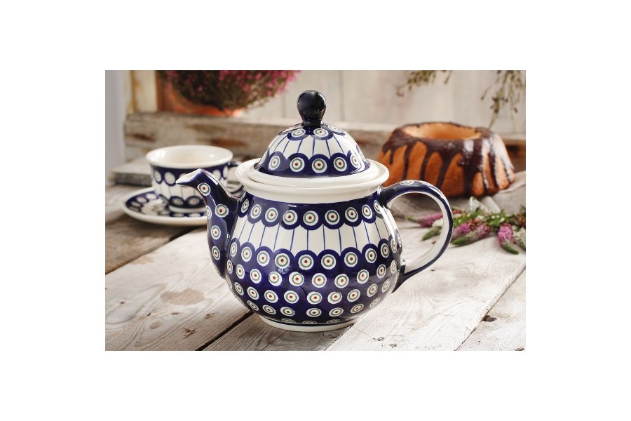
A ceramic
teapot design by the company called Boleslawiec- Poland


I have some
good parts for this illustration. It is time for me to scan them and work with
the Photoshop. Let's see what I can create with them. Perhaps I will continue Tomorrow.

Day 5
I wake up with fresh
mind today thinking of my assignment and what did I do so far. I know I am not there
yet to be happy with my design. I am still looking for the style I will be
comfortable with and proud. I thought that I liked the style from my previous
exercise about the street art where I designed a boy blowing the bubbles. I
actually think this is a good style. My aim is to sketch and draw some ideas
based on the look of this boy who looks like this picture underneath.

These are some
of my ideas from my sketchbook I have been exploring today. I think they lead
me somewhere at this moment. Is it going to be my last design so I could start
working properly on actual character? I am not sure. At least I made progress
in this Assignment in terms of developing some new ideas. I know my previous
Assignments were lacking this crucial part.


Day 6
Now when I know
approximately how do I want my character to look like I can start drawing bit
more and gradually get to the look I will be happy with. I am going to spend my
evening drawing on my son's little table and I hope to start thinking like a
toddler. I am going to be a toddler for one evening and ask myself how I want
my character to look like. I am hoping to loosen up bit more and try to break
some boundaries in my adult way of drawing and thinking. I need to get to his
level and draw from his little perspective. :)
My aims to Today are:
·
explore the subject of the shoe shop and the hairdresser
·
have some fun with during
this creative process
·
update the blog as I go
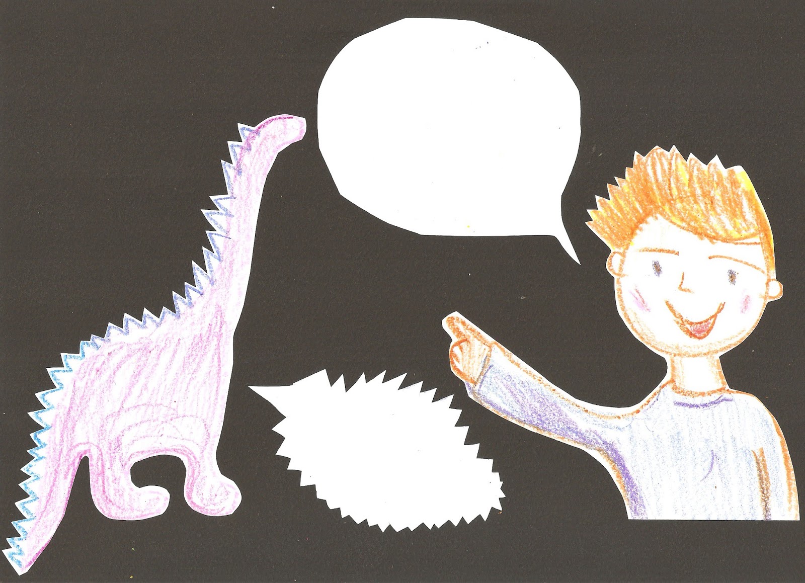
First I draw a
few sketches to make sure that composition will look well on the page. I tried
a few different ways of using the A4 size. As I am going to have a scissors and
a boys face and I will need some space to write a few words on my poster,
therefore I draw a simple shapes of these elements.
I draw 4 lines
to divide my paper and make sure that the elements will spread evenly on my
page. This is the best way to keep an eye on the good composition. If there is
a space on the paper that is too crowded the eye will fill tired. If there is not
enough going on in some part of the paper the eye will get bored and reject
this poster as something not worth of looking at and worth of remembering. I
have to make sure that there is just right balance on my poster. I know this
way will help me in rejecting the errors of the wrong composition. I can always
come back to my sketch and think again which way is the best.
YRH-stands
for you are here

It may sound crazy and
childish but I got inspired by the picture book under the working title:"
The day when crayons quit". I loved the simplicity of shapes and
brightness of colours. And the fact I was drawing on my son's table let me to
use them as a main media.
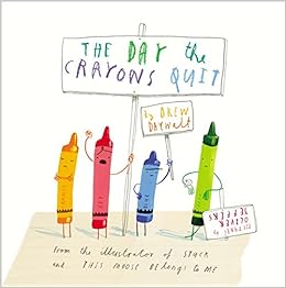
"The day when crayons quit" illustrated by Oliver Jeffers
I do not know
why but I have a good impression about this little boy. Perhaps he does not
look as young as I was planning at the beginning however I really like this character.
I have done my simple drawings using my son's crayons which I fell in love straight
away. They make the illustration so fun and colourful. I am going to carry on
with this simple media.
Maybe I should
create a nice and friendly animal or a creature which kids can get more
familiar with. These elements many times help to get them through hard times. That
is why they always have a toy like a comfort blanket to focus on something pleasant.
Maybe I will try to blend a dinosaur in a pink colour? Dino that boys will like
and I could use a pink colour for girls. That
sounds like a good idea.
As I am working
on the poster for the shoe shop I decided to draw simple shapes of shoes for
different seasons of the year. You can see the spring, summer, autumn and winter
shoes. What I like about them is simplicity of the shapes and bright colours.

As I have a few
places to work with and different ideas in my head it is hard to focus on one
and not to create or at least record another idea. This is my quick drawing of
the scissors for the future hairdresser poster. I will see how it fits with my
idea in a wile.
I am also
looking at different backgrounds in terms of colours. I have to check which one
will create the best impression for the kids. What I am looking for is something
bright and positive. Will I stay with one plane background? Or maybe I will
create very busy background? Who knows?


The more I work
on this assignment the more I want to experiment. Sometimes I think I should
stick to one style. If that would be so easy to do I would not have to try
again and again. I just think I am very close to rich my good style. I know I
am not there yet. I am close; however not at the finishing line. I am not happy
with the type of font I have used for this poster. I need it to be very close
to hand written font but it has to be seen from the distance. How about if I
draw a black line around my handwritten letters? Will it help to be better seen
from the distance? At the moment the background clashes with the nice style of
the boy shape. I will have to think something different. I just can't say I
really love it and I know it is far from my personal art taste. I just would
not like it if I have seen it in the shop.


It has been a
long evening for me and it is time to stop my work. I will sum up my Today
outcome in a few words:
·
Boy character is nearly there
·
I dislike the background and there is a lot to be think of.
·
The font is OK but it does not look professional enough for this
project.
Day
Yesterday I was
really confused which font would be the best I decided to use my "Encyclopaedia
of typefaces" Today. It is really good book full of many typefaces. I
should look in to bit earlier. This is
the font I will stock to and it calls Tempo Inline. It is the last typeface on
the scanned page. If you ask me why I pick
this one it just looks to me great. It is quit big and the shapes are bold so I
think it will look good from the distance. Another point is I am hoping to
write everything therefore I need have some space for uneven lines.


I was tiding up
my son's books this morning when I spotted one and I knew it was the one I was
looking for all the time. The front page was interesting because of the layout.
The idea is very simple but really works from any point. The illustrator was
clever enough to fit big letter and small at the same time and it is all clear
enough to reed because of the round white background. I am going defiantly use
this with my next few posters. Lauren
Child you defiantly inspired me :) Thank you!

It feels like I
just had a break through with my assignment. This first stage of my poster
looks as good as I wanted to be. I am pretty sure I will carry this style
through the all assignment. It looks clear enough to read because of the white
round background. I am very content with the size and the shape of the font.
The boy and the girl are sweet and likable enough in my opinion and I am
confident enough to keep their look as it is. I do not want to touch or change
their proportions at all. I am happy with the colours and the line.
This is the
first part of the poster which will contains the name of the place and the phrase:
"You are here at..." I am planning to keep nearly the same look on
every each first part. The boy will stay the same; I will also keep the round
white background and the size of those two different fonts. I am not sure if the big name of the place will look better with the black bold shadow? I think it may help a bit in reading from the distance. I will possible stick to this idea.
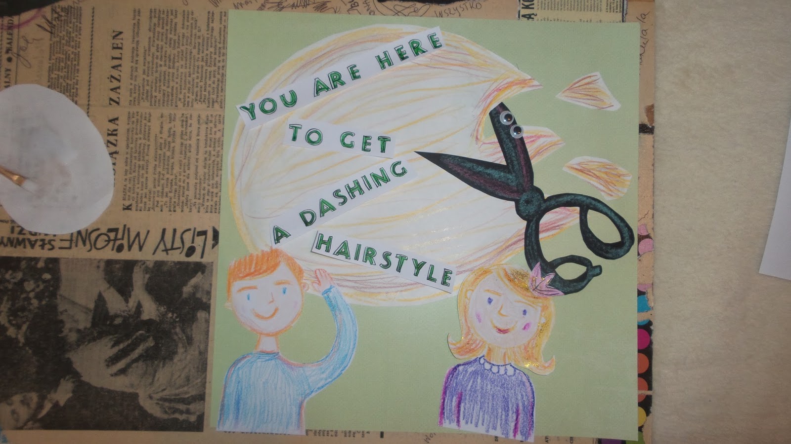
The second part
of the poster will explain the young audience what they may expect from the
place they are about to enter. At this stage I decide to change the big main
paper and I used different colour than with the first part. It looks well to
me. I have also changed the look of the scissors and cut out the shape from the
black paper and stacked a pair of googly eyes to make it more fun and cheerful.


I have also cut the end of the white background as if it was a hair that needed to be cut. It looks great and gives enough good sense of humour to this work.

I left myself a
bit more room to play with the letters on the second part of the poster. However
I am not sure which of the style I will keep. Am I going to stick to the
straight line or will I be braver and keep the one with the angle? I am not convinced
about that. Possible it is good to take a break and come back to this project
another time?
day
Today is all
about the nursing and care home. I wan to carry on the style I have developed
yesterday. I am going to work with the sketch book and make most of my comments
as I go to help me in creating the image of the character of a Nan and granddad. I am aiming to spend 3 to
4 hours today and make sure that the poster is almost finished.


I have managed
to finish this illustration. I can not express my happiness for the fact I can
close this chapter with the nursing home. I really do not want to change
anything. It looks consistence and visible letters make it easy to read the
massage. The granny looks just perfect. She is not too old and not to of
putting for the audience. By adding some small pearls I have achieved friendly
but respectable look. The image of the
care home looks great and it makes me smile whenever I look at it. The shape is
good and the colours are bright adding extremely good touch to this
illustration. It looks like a castle where every child would like to come and
play. I have used the crayons for the rainbow and the waterproof ink for the
rest of the castle.


My aim for the
next day is to focus on the poster for the vet. I am sure my work is going to
be much easier since I finally made up my mind about the style.
day
I have got a
clear vision of my next poster. However it may always go in the totally
different way then I plan at the beginning. I hope I can stick to my current
style I have developed in the last two posters. Will I make it as a good
selection of illustrations? I would love to see my poster as a group of the
same style illustrations.
I am planning
to work today on:
·
sketching
·
creating a nice and friendly animals
·
creating the vet
·
thinking about the words for 2 parts of the poster
·
updating the blog as I go
These are my
quick sketches representing the page layout and the animals with short
comments. These comments make the creating process so much easier as i clearly
say what do I like about the character and which of the features to keep and
which one to change.


This time I haven't
spent so much time on experimenting on the look of the animals. I knew how I want
them to look like. The moment I started sketching them I could see i was on the
right track on creating the one I wanted. This is my finished illustration in
black ink on the white A4 paper. I am going to use my waterproof colour ink to
make them more vibrant.


These are my
sketches in progress to the vet character with a short notes attach to them.


I wanted to capture
my real work with the nearly finished drawings. The pictures show me working on
the layout and the compositions. I was inspired by Lauren Child when I saw a
short movie about her new book. This is the classical way of working on the layout
without using a computer.


Once I made my
decision about the composition it was time for me to start sticking every
individual part of the illustration on the paper. i am very pleased with the
final look of my poster. I am happy with most of my ideas and the all process
of working on theme.


The last part
of my assignment nr4 will be writing a short self-reflective note. I will do it
tomorrow.