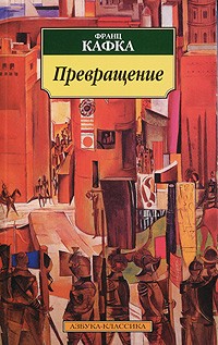
Research point 1: Franz Kafka
I started research of Metamorphosis by Franz Kafka from looking on internet by
typing: "Die Verwandlung"(German),"La Metamorfosis" (Spanish),"метаморфоза"(Bulgarian) Franza Kafka and this is what I managed
to find:
Book covers:


Spanish:


Bulgarian:
English:


This is a very dark story where the main character is transformed into a
beetle. The vast amount of illustrations
I could find on Google were treating the beetle as the main theme of the story. Therefore the front covers have the beetle as
the central image. The man turning into
the beetle is another key theme, one showing a man with a beetle-shaped
shadow. Most of the pictures from
theatre productions show a very plain but dark room where there is a table or
just a bed. The atmosphere of the room
and stage is gloomy and miserable.
PRODUCTION BY ARTHUR PITA, WITH PERFORMER EDWARD WATSON
PLAYED GREGOR, WINNING AN OLIVIER AWARD FOR HIS PERFORMANCE.
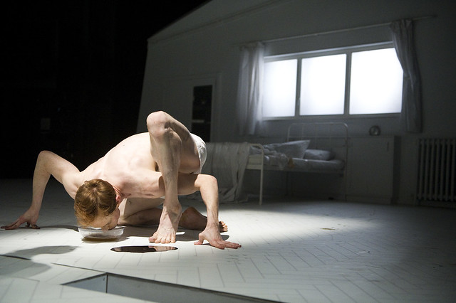
http://www.roh.org.uk/productions/the-metamorphosis-by-arthur-pita
Research point 2:
Pick a range of examples and
discuss how the relationship between image and text works.
- "Peppa Pig - Daddy Pig's
lost keys" - bold white letters in the middle of the page, perfectly
matching with the illustration for young children to look at.
- "Scratch-and-see secret
message cards" - letters are very
different in colours and shape, great design, very catchy and fun. Looks like some of them are hand-written, no
pictures at all, just text.
- "Lola's forever" -
cook book - very stylish letters in the middle of the front page, bright pink
colour to catch the eye surrounded by cupcakes.
- "Usbourne Illustrated
English Dictionary" - quite a lot of different kind of pictures around the
book title which is placed in the middle of the page. Very good execution of the page. The words and the pictures go together well.
- "Horrible Histories: the
beastly best bits" - illustration by Martin Brown - very big black and red
letters, placed in the middle of the page.
Small pictures of characters on the top and bottom of the page, however
the sticker placed on the main title is very well designed to give another
dimension. The book meets the young-aged
audience's expectations.
- "Animal Kingdom" -
Millie Masoota - this is a colouring book with a lovely design, full of small
and sophisticated patterns that transform into animals. The letters are placed on the top left corner
of the page, perfectly matched with the colour of the drawings.
- "The Six Sisters -
Minerva" - M.C. Beaton - this has a chick-lit. picture on the cover on the
book. It has more to tell about the plot
that the other covers I have seen so far during this research. The illustration is kept in the style of the
period and the style of the letters is good for the target audience, placed on
the top of the page.
- "Seagulls in the
Attic" - Tessa Hainsworth - has a lovely picture that takes about three
quarters of the page and the rest has been used to show the nicely written book
title.
- "The Marriage Plot"
- Jeffrey Eugenides - has a red background and white bold letters. The only illustrations are the 3 flies placed
around the page in an energetic manner to give depth and movement to the page.
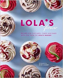

"Lola's forever" "Illustrated English Dictionary"

"The Six Sisters - Minerva"
Research point 3:
Exercise: Once upon a time
My task is to create a series
of drawings/illustrations based on a folk tale.
I was wondering which country to choose form and after research, I chose
a Polish folk tale about the farmer and the bear. This simple, but lovely tale starts when the
bear hurts his paw with a spiky branch.
The farmer sees this and without thinking, helps him to take it
out. The four seasons pass and one day
the bear sees that the wolf is watching the farmer with the intention of
hurting him. The same bear.............................

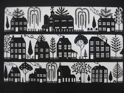
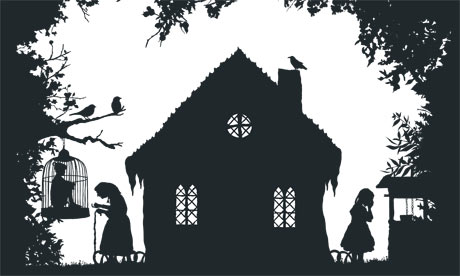
folk ark black and white paper cut
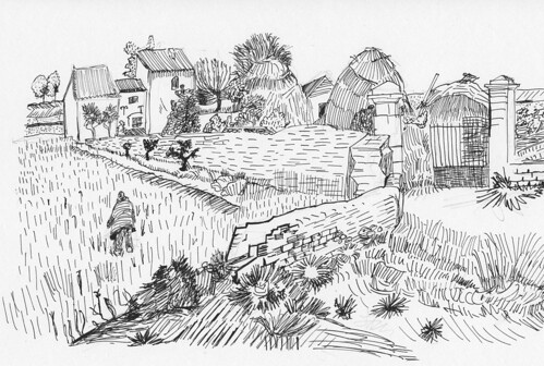
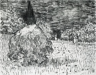
Vincent van Gogh pen and ink

This is
the stage I like the most, where I can spend some time on sketching and then
working on the illustration by thinking how to build the image with lines. The structure of every part of the page will
be built from dark lines where every one is important. Therefore I have to think about where to put
the most lines to create a good visual effect.
I am pretty happy with the general sketch of the bear and the farmer,
all I have to do is take time to work on the lines.

I have been working for more than 3 hours on
this illustration. I am very pleased
with the outcome. I took it slowly,
working with Photoshop, drawing line by line.
I am happy with the bear as he is the most important part of this story
therefore I took time to build up layer by layer with black thin lines. I am going to leave it as it is to not
over-work it. I added some trees in the
background and bushes to fill the space and create an atmosphere of wild
nature. I have also made the farmer's
shoes the darkest part of the illustration to show that he is doing physical
work as he needs some heavy shoes to protect and support him. The shoes contrast well with the white
ground.

The bear
with a big sharp object in his paw is trying to ask for help. He is in pain; therefore the farmer is
willing to take it out. In this sketch,
my bear is nearly hugging the man and we can see that he is overall a harmless
animal. My illustration will have only
him and the farmer but I would like to pay attention to the bear.
My second
black and white illustration looks good.
I am very content with the result.
I have spent more than 4 hours on this one. The most time consuming part was the little lines
on the farmer's clothes. I have also
added some bushes in the background to fill up the blank space. They do note any more meaning other than
making a good composition. The shadows
in this illustration are built from long thin lines just to give a dimension of
space and the ground.
This part of the story is more compact. I needed to place three elements of the story
on one page. The farmer not knowing that
he has been watched by the wolf, the wolf watching the farmer and the bear
looking at both of them from the distance.
I needed to make the most of the space of the A4 paper.
My first aim of this part is to make the big
bear standing in the distance more visible by making him pure black. I am not sure how it is going to look like
with the rest of the elements of this illustration. I am happy with the shape of the wolf and the
farmer.
I just finished drawing the wolf standing on the
rock; however I am not happy with the bear now.
When I compare the bear to the wolf and the farmer, it looks like a
small black hole in the top right corner.
I have to change it and build his body from small thin lines, as right
now he comes too close in the foreground and I want him to stay visible, but in
the background
This is my illustration after some small
changes. I see that it works much better
as the bear is visible but not too overpowering on the page and finishes off
the composition in a triangle shape. I
am not going to cover the trees and I will leave them as they are just like a
blank white space, just shapes so they can build a sense of the forest.
This is
the part of the story where the bear fights with the wolf during the
night. I am not sure what to do
now. Should I cover the page with small
lines, building up the space or should I leave the illustration as it is but
draw the moon and the stars?? I managed
to create the illustration based on the dark (black) background where I only
needed a few white lines to the shape of the bear and the wolf. I also added the shape of the moon and a few
stars to brighten up the sky. I also
managed to create some movements by placing three long lines next to the bear's
paw to show that he was trying to scare the wolf away.
I have started this exercise
from a spider diagram and idea board.
The spider diagram was helpful to me, however I find the idea board more
appropriate this time as I could experiment with the black and white colours
and the lines on them. I could see how
the white lines/spots look on the black background and black lines on the white.
I draw all my illustrations
from secondary sources. I
researched the exercise in terms of artists who do folk art mainly in black and
white tone. That art is called paper cut?, I have also
broadened my ideas based on images of the wolves, farmer and the bear. I wanted them to look as real as I
could.
For this task I have used the
following media:
- white A4 paper
- black pen/pencil
- Photoshop
Did I use the media in the
right way? I hope I succeeded well in
this task. I had no problems with
drawing these illustrations as I really find black pen easy to work with. It feels natural to me as this is the media I
have been using for many years, even back to school where I drew doodles
wherever I could.
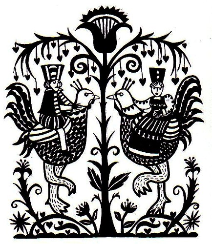
I already had an idea for this
task in my head, however I needed to broaden my mind a bit, therefore I found a
bit of work from Pienkowski
who does excellent illustrations based mainly on black and white colours. I could see how to operate this medium
well. I was also studying work of Van Gough but only his black and white drawings to see how he used the line to build
space. His work was very inspiring to me
from the visual side. I also looked for
folk art from Poland, however I do not think it has a bit
impact on my work.
When I was working on images I
had to be focussed to describe the shape with lines therefore I was thinking
where and which direction to put the next line.
It took me much longer than I expected, nevertheless I am very please
with the final result. As I was limited
with the colours, it was hard to experiment as much as I wanted. I was lucky to gave the light box which
helped a lot in keeping the characters in the same look and style.
I did try to show the emotions
of the characters and the state that they were in. I know this was a key learning point from earlier topics, as previously
my drawings have not focussed on characters' faces and I knew I had to start
tackling faces and in particular expressing their expressions and emotions. Therefore in what is almost my first attempt
in this area, I enjoyed it and it was interesting to create a little short
story in the illustrations.
What are my future targets after this
exercise?
I would like to
explore more black and white technique using only fine lines.