Thursday 29 January 2015

Project : Visual space


Research point

Find examples of illustrators who have designed wallpapers, fabrics, wrapping paper or for other flat surfaces that you find interesting. How do their illustrations play with the idea of flatness?


Daniel Mackie


http://www.lizzieallen.co.uk/redbus_blackcab_2009/redbus_blackcab_2009.html


Exercise: Visual depth

Produce three drawings depicting a room in your house using one-point, and three-point perspective.
Produce a fourth drawing using isometric projection to represent the room.


Produce a fifth drawing of the room in which you deliberately break the rules and draw the space with its own visual logic and finally, do flat drawing.

Write around 200 words analysing how these different approaches affect the ' meaning' of the visual space being represented. When you choose to draw with or without perspective what is this saying?


I am in the middle of this exercise very excited to be able to work and think about perspective. I found a short movie on You Tube     (https://www.youtube.com/watch?v=yEymIyLbiAI which shows how to draw a room from one point perspective. I have always been struggling a bit with perspective and this clip made my life so much easier. I do admit that I have been always making the same mistake while drawing something with one point perspective. I always start from drawing everything what I wanted or needed to place on the paper then finding one point on the surface and at the end drawing long lines from the objects to that one point.  As a result my drawings have never been perfectly in perspective.  The good way of doing this exercise is to draw a single spot on the paper then the rest of the room fallowing the straight lines from the spot to the object.  And this is my first attempt of this exercise.  It is not perfect however it looks more like a drawing that is built on construction.


This is a drawing of my bedroom from one point perspective.


Wednesday 28 January 2015

Exercise: Less is more

 Exercise: Less is more

Identify a palette of no more than three colours that could work in combination.  Use this palate to illustrate five domestic items beginning with the same letter of the alphabet.


I did a couple of sketches with pencil just at the beginning of this task. My chosen items begin with the letter S, like: a shoe, a spoon, a saucer, a saucepan and              


The colours chosen by me are not the one I would use for my paintings, however I wanted to do something different and be surprise with the result. Was I really surprised?   Yes, definitely doing something different brings good result for the artists who experiment with given brief. I realised during this task how careful I have to be with black colour as it comes forward no matter which colour I am going to pare it with.  


black-pink-yellow 


black-green


black-pink

This exercise helped me to understand bit more about the relation between the surrounding of the object and the colour of it. Having limited amount of colours to use to draw an object helped me to focus more on the actual object rather then the colours. Having said that I though about the colour as way to describe the shape of the object. I had to think about creating the space only with the line and the colour and that was not easy.  


Tuesday 27 January 2015

Project: Your tool box - Exercise: Mixing and matching

Exercise: Mixing and matching

Working around the theme of 'hybrid', create a series of illustrations using the following processes:

Statring on paper and moving to a computer, follow this process:

DRAW-SCAN-COLOUR


I picked two different types of flowers for my hybrid. I will draw a rose and a sunflower. Let see how it is going to look like.


And there we have a stalk and leaves from the rose. I created shape of the flower crown based on the sunflower. The crown is a mixture of rose and sunflower petals.


I have scanned my sketch and saved on my computer then started to colour it using Photoshop.  


 They were too vivid. Nevertheless I like this technique as a way to improve the illustration or a project I work on or I will be working in the future.


It was good fun therefore I decided to make another attempt to create hybrid out of a shoe and teapot. This one is called: Teashoe      


Starting on the computer and then moving to paper

COLOUR-PRINT-DRAW


I like this effect created by using suggested technique. There was a lot room for me to make this illustration not as that polish as the previous one. I do feel more comfortable with this way of working it is just like creating a colouring book but in the reverse way, if that makes sense?  You work on the colours then you create lines and sometimes you can skip one or two to not make such an obvious shape.
 

I can also see the difference between the colours I have used in Photoshop and the colours from the printer. I have to admit a big difference in saturation and tone of the colours.   


Exercise: Draw, draw and draw again


1) Draw  what's in the photograph- Try to record all the information from the photograph in your drawing


There is an excellent picture for this exercise on my computer and it has everything I need to practice my drawing skills. It has perspective, as well as some movements between the dog and two characters and it also has sht. going on in the background.  


I did record everything that is important and it took me about 15minutes to do it. As it is only a sketch therefore I did not go into big details.


2) Now, draw it second time but do it quicker only with the most important information.


It is amazing how brain works differently when it has to focus on the most important parts of the picture. And it is not an easy thing to tell yourself to capture only a small part of the information. I did have to stop myself from overdoing this sketch. Did I do it well enough? I hope so. 


3) put the original photograph away and draw it again using your memory and the other drawings. 


I did like that part of the exercise as I was freer to create my own illustration. As far I can see I draw similar drawing to the first one but the line is looser and relax. I had a guideline with the most important notes of the subject I was drawing; however I did not have to stick so much to it. I like it as I had to talk about this picture with myself to make it work.


4) Finally, draw it again, this time with no reference material at all.


This time I created a sketch totally free and relaxed as I had only my memory as a guideline. It was quite new experience for me as I usually draw something from a picture or direct observation. I knew that I do not need to be so strict with make it so real therefore the lines look like it is a caricature. This is how I think when I look on that picture and compare it with the rest drawings.
 
  I draw deliberately some parts bit different as I wanted to make a female character bit slimmer therefore her body is longer and thinner. I did remember how to draw some parts of that picture and it was much easier to make the changes as my hand did not think so hard where to fallow next. I do admit that working this way on the illustration by repeating the lines makes a different when I wanted to create my own drawing. My hand and mind was more confident in movements. I will use this technique again in my next projects.


Thursday 22 January 2015

part one - introduction

Research point  1

Find out about the world of illustration by asking 'who's out there and what are they doing?


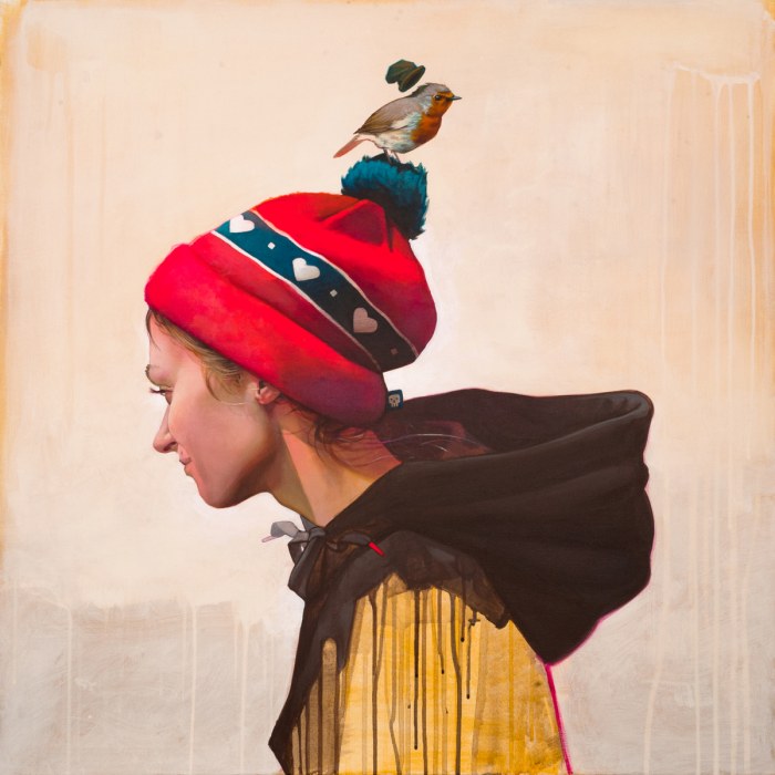
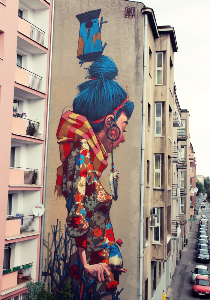
http://www.etamcru.com/


https://www.youtube.com/watch?v=rHCb-F270cI


Research  point 2

Reflect on your illustrations, drawings and sketchbook work. 


After reading my course notes for chapter 1 from Illustration year 2, I started to think about my work that I have created in the past and compared it to work I have completed recently. I have begun to wonder what was important to me when I was at the beginning of my art education in Poland a good few years ago...... and what is important to me now.


I have to say the work I enjoyed the most was when I could be free and not worry about the mess either on the paper or on the canvas. The work where I did not care about the lines and perspective, where I could express my mood and my inspiration. 


The lines should tell so much about me as an illustrator and creator of visual work, therefore sometimes they may be very chaotic and other times may be more in order.

When I was in high school, finding personal voice in the art was not easy.  Sometimes my tutor was telling me that I think too much before I make a pencil mark on the paper. He advised me not to think at all and that making a mistake is also good way to learn new things.  My sketches and first stages of paintings were the best as I did not think too much while I was working on them. The best part of my work was the first rough stage, before I started to over-think and over-work.  This constructive criticism seems to have followed me, as each of my OCA tutors so far have made similar comments.  I will therefore try this year to work on this.

old paintings and sketches

First stage of the painting oil on board


Painting in progress


Painting in progress part 2


Lady and the peacock  oil on canvas unfinished


Kids playing during the May Day oil on canvas - finished 


Painting of my friend  K. in progress -oil on canvas


Finished painting 


Painting of my husband first stage - oil on canvas


finished painting


Painting of my sister first stage - oil on canvas


This painting has never been finish as I could not work out the final result I wanted to achieve.


A  rough sketch of my sleeping dog - pencil on paper


A rough sketch of my sleeping dog- pencil on paper


A rough sketch of my nana - pencil on paper


A rough sketch of my sister washing her hair - pencil on paper


A schetch of my right hand- pencil on paper


 last illustrations - mixed media


What do your choices say about your developing voice as an illustrator? 

I have been looking at some of my art projects I have done in the past using oil paints and pencil. This is not the most recent work and the style which I use to create my illustrations, it is just a reflection about the project in which my work develops. At the beginning of my course I decided to reflect on my strong and weak sides when I create an illustration.  I want to develop my voice, which has still not totally formed, this is the voice that could change at any stage of work. My question is: At what stage should I stop working on a particular illustration? Do I have to work hours and hours on one illustration to make it good or should I stop when it is fresh and vibrant? 
 
The choice I have made shows I like to illustrate people, animals and capture their movements at the moment of looking at them.  However I don't think my voice is strong enough at the moment to describe myself as a mature illustrator. Maybe I'm wrong...  I still want to find my style and then I could take it to a different level where I will be more comfortable with expressing my thoughts. It's still a part of the learning curve.


How do you see yourself developing in the future? 


This is difficult question to answer for me at the moment. I am a mother of a wonderful boy that keeps me busy nearly all day; therefore it is not easy to find more time for me to interact with other artists face to face. However  as I am planning to be a children books illustrator having a little one gives me an opportunity to watch and learn while he is exploring every part of life. I am able to record some daily observation on paper while my little boy is practising some amazing new skills. This is my aim for the next few months to be very active as an illustrator to do as many sketches of my little one as I can.  I do believe in this way I can develop well as an illustrator.


What sort of projects are you interested in exploring and what skills do you need to develop? 


As I said before I would love to be an illustrator for children books in the future. My current plan is to create a book for my little one so he could enjoy reading with me the story about himself. To do this I need to be able to observe his attitude and reactions to daily activities. I should make as many drawings of him as I can. This is an amazing opportunity for me to create a character for the book that is consistent in style and the look. It will be my first personal project and I am excited to take to another level as I will do it with passion and commitment. The skill I would like to develop with this project is to be consistent. I would also like to try as many ideas as I can and not to stop on the first one will come to my mind.


Research point  3

Visual language
Reflect on your choices. Are there common threads emerging?  Are you drawn to particular visual cultures, contexts or styles? 

What do you think this says about who you are as a developing illustrator?