Tuesday 31 March 2015

Project: Natural sciences; Exercise: A rose by any other name


Exercise: A rose by any other name


I  copied  this picture from Wikipedia as a part of my research for this exercise. I am going to draw a few more detailed sketches based on my pink flower unfortunately I have no knowledge about the name of it.
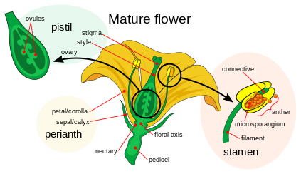

http://en.wikipedia.org/wiki/Flower


 I am going to do more drawings based on this flower I had at my home.


I got inspired while watching Chanel Haute Couture Spring Summer 2015 Fashion Show on You Tube. The colours are really beautiful contrasting with bold white background. Another reason why I mentioned this fashion show is the shapes of flowers and the line is sharp and simple. This is wonderful inspiration for my project.  I will design my illustration based on similar idea.


https://www.youtube.com/watch?v=s2hGnyb1ju8


I wanted to add some of the Chanel glamorous to my flowers therefore I used my glittery watercolours to paint them.   


day two


Today I would like to try something new with my illustration using the Photoshop. I am terrible in making comments while I use this computer program.  All my thoughts are hard to put on paper while I work on the illustration as is easier and quicker to change the concept on the computer but hared to remember why I made the change. I do not have any problems to make a comment when the illustration happens in organic way, when I do remember why the line or a dot I made happened to be in one or another place on the paper.  I am such an old fashion artist in that respect :)


glowing edges


cut out


invers colours


It was nice to experiment with this illustration. I do not know if I managed to make any progress however I used one of the techniques gained from previous exercises. I scanned my illustration then I worked a bit on that with Photoshop, next step was to print it out on A4 paper to be able to work with black pen on details. This is how it looks like as a finished illustration.
 
I took an inspiration for the background from Chanel greenhouse from fashion show last year.


Screen shot 2015-02-02 at 10.55.50 AM 


Exercise: Drawing on location


Exercise: Drawing on location

I was invited to the party while ago where I managed to do a few illustrations sketching with the brown pencil and adding some vibrant colours with water paint.  Now I have time to reflect and ask myself questions about what I did over there. How did I feel when I was drawing the illustrations?


This is my first record of that event. I do remember the stressed I put on myself  just because I wanted to produced the illustration so everyone present at the place of celebration could enjoyed and be pleased with.  I did not where to start with.  I did not if I should ask everyone to stay still and not to move so I could draw every detail or should I crack on and draw what I have been witness off.

This drawing is very polite and kind of naive in style I think.  I can see the line is not as that important tome here as the facial expressions and some similarities of the guest I wanted to capture. 


This second attempt started to be more interesting as the composition became more difficult than on the previous one. I am happy with the pencil lines which made this drawing more relaxed. I definitely improved my technique already with the second illustration. The fear of being judged by others disappeared and I wad able to talk to myself while I was making the sketch asking what I want to achieved with this picture. What do I want to capture? What is the most important part of that drawing to me?  I can already see the different as the drawing looks more thought through.  The faces were less important at that stage. I decided to focus on differences between characters and personalities of that party. You can see that there was someone who was already tired and perhaps bit bored of the conversation, maybe? There was a lady who smoked a cigarette and two people simply enjoyed their food.  


This third one is my favourite from all.  The lines are looser and relaxed.  I managed to focus on the activity that party guests were enjoying at that moment.

Friday 27 March 2015

Project: Architectural illustration; Exercise: Architectural illustration


Exercise: Architectural illustration


After reading this exercise I went to the Bishop's Stortford to have a good look of the buildings and their surroundings. I did not know which one I was going to draw; however I knew I will focus on an old building that is surrounded by new one.  While I was walking I passed an old house which is the Registered Office of this town allocated very close to new buildings. I took a couple off pictures and did some quick sketches then went home to work bit more on this exercise.


I do know I struggled with perspective in the past therefore I do want to make this exercise more carefully. I will use a rural to make the lines straight as these drawing demands it. 


sketch one


I picked this sketch as an idea for the illustration. I have to make it looks tidy and neat therefore I am going to use the light box to trace the most important lines.  I am also going to draw it with the rural as I mentioned it before. Let's do it.  


sketch two


sketch three


drawing with more details  


I am happy with the look so far.  This is a good base to scan and work on with the Photoshop.  My idea is to use some grey texture to the background and gradually reveal the contrast between the grey new buildings and white old house.


drawing with a rural 


This is my illustration in progress.  I have used small square paper painted with different grey colours for my background. . I am going to leave it for today knowing to come back later. Maybe this is the finished illustration already? Who knows? I started to make a colour white statement on an old building.  Maybe I should leave it as it is as i remember the comment from my tutor report of my Assignment 1 that the illustration was good already at the beginning of my work. I should know when to stop. The only thing I may do it with this illustrations is to crop it from the bottom of the illustration. I think the composition will look better without the empty space at the bottom of the page.  


Sunday 22 March 2015

Part Two - Reportage Exercise: Drawing on the familiar

Part Two - Reportage

Project - Reportage illustration

Exercise: Drawing on the familiar


I could not think about better subject to draw like my 21months old Leo. His day is always busy and full of unexpected events which are interesting to be capture on the paper. I started my sketch while he was still sleeping in the morning, where the play area was clear and unused by little curious hands.


I let him to spend some time amongst his toys then I have moved on to capturing his little activities.  That was more difficult than I expected as Leo was very busy and he could not stay still for a second.

I have mixed emotions with the outcome of this exercise. I am not happy with the quick sketches I have done using black water paint. Maybe is the fault of the medium I used or the fact that Leo was constantly on the go. Or maybe my lack of skills in asking myself what is the most important part of this exercise. Just because I was drawing and watching my little one I suspect this was the main issue as I could not get the distance to the person I was looking at and working with. I wanted him to look similar on the sketches as he is in real life but at the end I achieved totally opposite result in my opinion. I do remember the inner frustration when Leo was moving on to the another thing while I was still trying to capture on the paper his first activity. I do see there are some inconstancies in the style between one drawing and another which I am not happy with.