Exercise: Animal farm
I am surrounded with children book at the moment as my 2year old boy loves them much especially about the animals and dinosaurs, I decided not to look at any of these to not to copy any of the characters. I needed to develop as an illustrator and fo
llow my own ideas. I know it is not easy especially when some of these illustrations are already in my memory and some specific styles written in my head. I think I have to start from the basic. My decision about the books I needed to look was totally based what I already said above. No other children book illustrators were allowed for my first research. These are the titles of the books I am going to use at the moment:
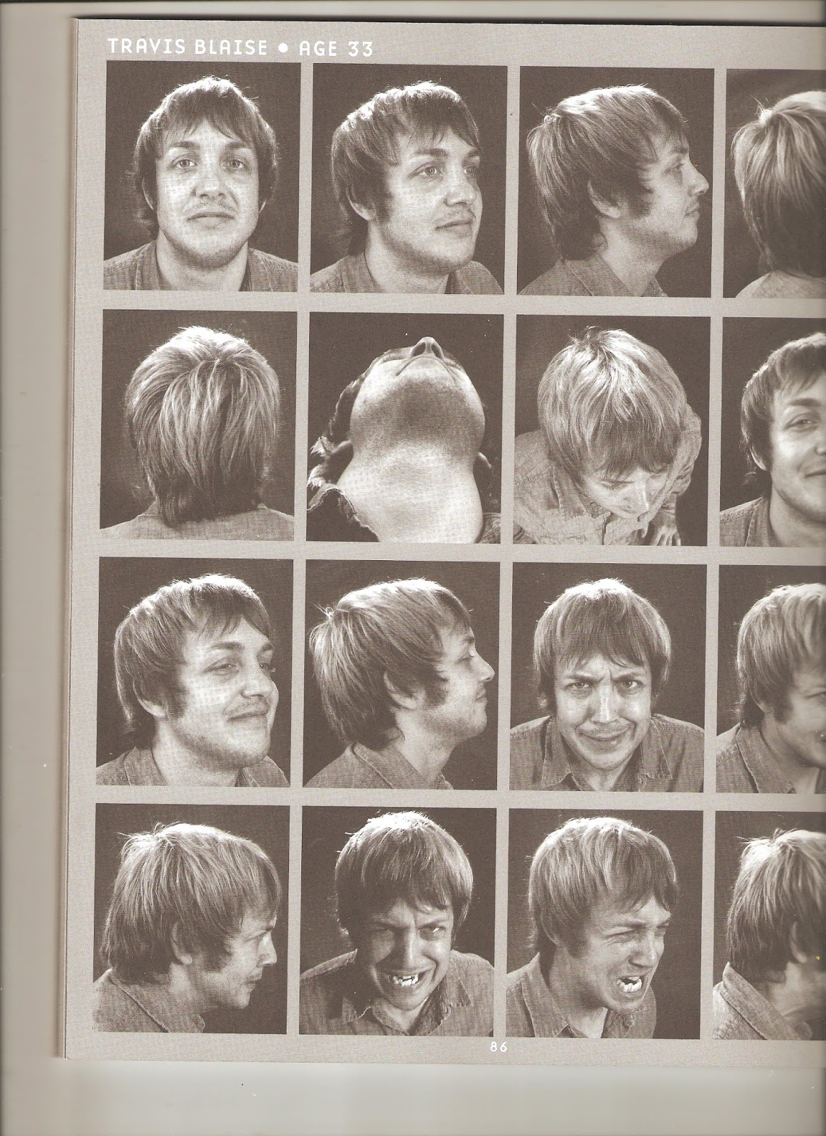
"Facial Expression" to look for the face references and to create different and moods.
"Animator's Survival Kit" to look for the best character body movements and positions.
"Snow White" by Walt Disney to seek some tips how to develop a character
"Dog Days" by David Hockney to help me look at the animals from a painter point of view
"The


I have started working on the characters for this exercise. Although through drawing them again and again I am not really happy with the way hot they look at the moment.
I have started working on the characters for this exercise. Although through drawing them again and again I am not really happy with the look of them. I decided to pick hamster to start with just because I have one at home. I thought it will be easy to draw different face expressions and gestures as they are so nice and furry but after a while of studding my own pet I got to the conclusion I was mistaken.


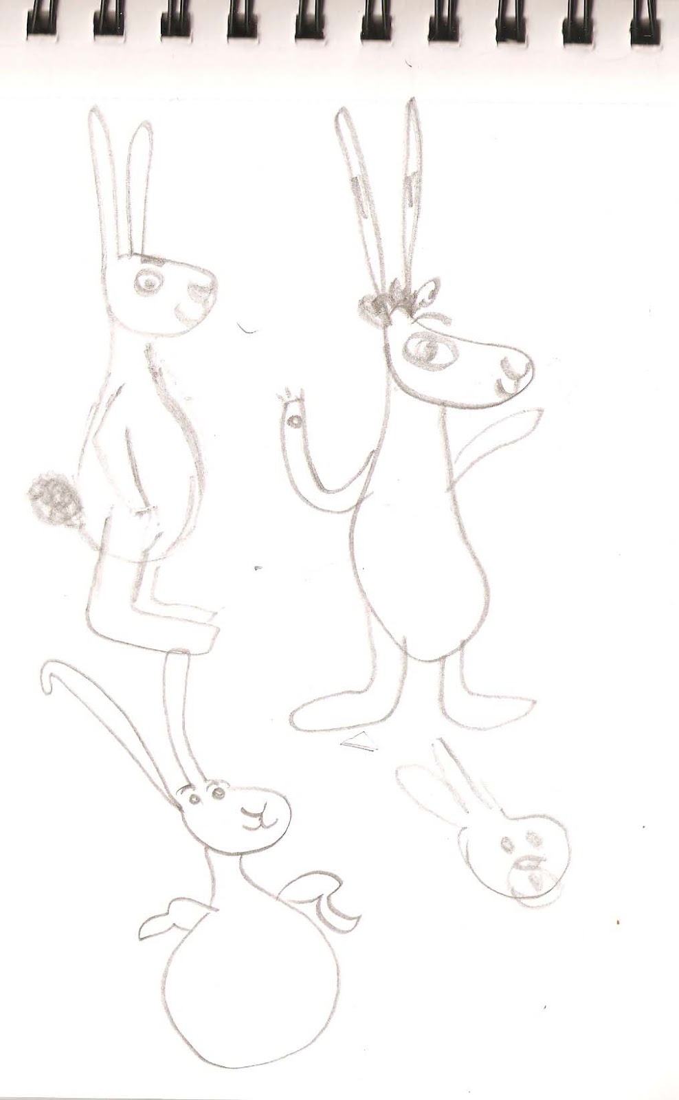
My next animal is the rabbit but after a couple of sketches I decided not to go further with this character. I am absolutely not happy with the look of this animal. I will drop it as it is and go for something different.
As I felt like I was stuck a bit at that point of this exercise. I opened a You Tube and I found great tutorial how to draw a cartoon animal character. And that was massive help for me.
How to Draw Cartoon Animals which I found on You Tube :
https://www.youtube.com/watch?v=YYpz5qwY3HU

So I started another animal but this time I picked the cat.
So I started another animal but this time I picked the cat. The biggest difference was the way how I started to look on the character. I totally forgot about the body structure and this was missing all the time in my previous characters as I suppose. When I finally draw a head of the animal just as a simple round shape but not flat at all with the line in the middle of the head as a reference point I have to say that everything was much easier. I finally felt like I was in control of development of the character. Suddenly the animal is not floating any more and I could focus on the actual face expression just because I had created basic shape of head.


Just as I was working on the cat and the dog I just thought maybe I could comeback to the hamster. I managed to draw it again but I was not really happy with the look again. It is ok and defiantly more developed as a character but it is just missing something again; however I am not sure what else.


Lynn Chapman

https://www.youtube.com/watch?v=LKlME1rGoy4
https://www.youtube.com/watch?v=NN3J_jKTLxQ
https://www.youtube.com/watch?v=o5DQXg86luA
Judy Brown


Animal Farm
Self-reflections:
I started this exercise from research and looking into books I
already had at home. The
most useful book I found was "The Facial Expressions" that helped me to develop the facial expressions
and emotions while I was working on developing the animal characters.
I drew from primary sources using my hamster as a reference at
the beginning of this exercise. I have
also used secondary sources from books and the internet. The research I did at the beginning
definitely helped me a lot to develop my later ideas.
I would consider this exercise as a breakthrough in my carer as
an illustrator/artist, as I used different art materials to build up my
skills. The materials I have used are
pencil, black and colour water-proof ink, ink pen (very thin nib) and a brush.
Did I use the media successfully? I hope I did, nevertheless I am pleased with
this new experience as it really helped me to stat thinking in a different way
about illustration.
The line, shape and colour are certainly integral to the work in
this exercise.
I tried not to look at the work of other artists at the
beginning to not follow other styles.
However the only reason why I took some inspiration from a tutorial on
YouTube was to find some clues and guidance on how to make animal characters
better.It inspired me to work on the
character in a different way. I am now
able to build the character based on the note I make on each individual part of
the face/body.
I am also making other small changes in the creative process to
the look of the character. I always
thought that I have to add character details by changing nearly every part of
the face or shape of the body for the viewer to see a different character, or a
different expression. This illustrator
proved to me that I was mistaken. When I
put bigger eyebrows instead of smaller ones, believe me or not, the face
changed a lot. Now I know that developing
a character does not have to mean transforming every part of it.
Did I look at work from other times? I did, just a bit, look very closely at the
work of the most recent Thomas the Tank Engine animation film. I have not seen that particular character before, however I made an observation when I went to the cinema with my little
son one day. I noticed that for the
audience like my two-year old son, the character needs to have big eyes and
defining eyebrows to show the emotions so audience can understand quickly. This character was originally created in 1946 when the audience
did not have a choice and it was so important to find a character they could
relate to, at the same time as being efficient with the character details
(especially in a time before massive flat-screen TVs which make images much
larger than they used to be). I have
also looked at a Disney book based on the film Ratatouille to see how the team
developed the character stage by stage although I tried not to follow exactly
the same style.
I cannot tell how many times I have seen the 'behind the scenes'
extras on the Lord of the Rings and The Hobbit DVDs, which was where I was
introduced to artists Alan Lee and John Howe and seeing how they worked to
develop and create characters.
My ideas were able to develop during the process because of a
YouTube tutorial about how to create a cartoon character, where I have been
reminded to look at the character as a shape.
Only through this way can I create a head and a body that is not
flat. I cannot believe how I could
forget about this especially having a good few years of studying the human body
and drawing life models in High School, and this is such a basic skill.
Did I consider various possible solutions? I developed the characters at the beginning
changing the ideas. Later I decided to stock to one shape of the
character working and changing only small parts of the face to express the
emotions.
I strongly feel that my final character looks very different to
the one from the beginning. It looks
consistent in the form and the style as well as the colour. See the pictures below The light box was a big help to me in this
exercise, while I was sketching the characters then developing them stage by
stage.
To describe my final outcome I can make a strong statement of
how happy I am to finally mark the big changes in the style and the medium I
used. Consistency in the character is
very crucial for an artist's style. The
hedgehog looks the most professional piece I feel I could create at this stage
of my creative work.
Finally I have managed to change the way I think about sketching. I have followed my tutor's advice and have bought a smaller sized sketch pad. I changed the size from A4 to A5. At first it was not easy to draw on the smaller size paper; I have always used A4 as this was the size I felt comfortable with for the last 15 years. This time after my second assignment, I managed to break my 'fear' and work on A5.
I admit that I found it challenging at the beginning, however I started to be more comfortable with after a time - people say practice makes perfect!
I do not have to worry if I have too many subject
A5 size is perfect for recording your observations. It is easier to carry around as it does not take up as much space in my bag.
My tutor also suggested changing the medium I use, so I bought drawing ink, a sketching pen with different nibs. I had wanted to try waterproof black ink for a long time and now I have the opportunity to experiment with it. It is a massive difference how much I can change my style only by using different nibs. I am able to draw very detailed illustrations as the pen has very fine nibs to work with. When I am happy with the drawing, I can use coloured ink to give the object another dimension as the coloured ink is very clear and vibrant. It looks more professional than my previous work. I have not been able to reach my full potential creating work in the past as I could not work computer software as relaxed as I could with traditional media like pen or pencil. I simply changed my creative life from that moment
No comments:
Post a Comment